
Writing Without Words
Writing Without Words was a project completed during the final year of my MA in Communication Design.
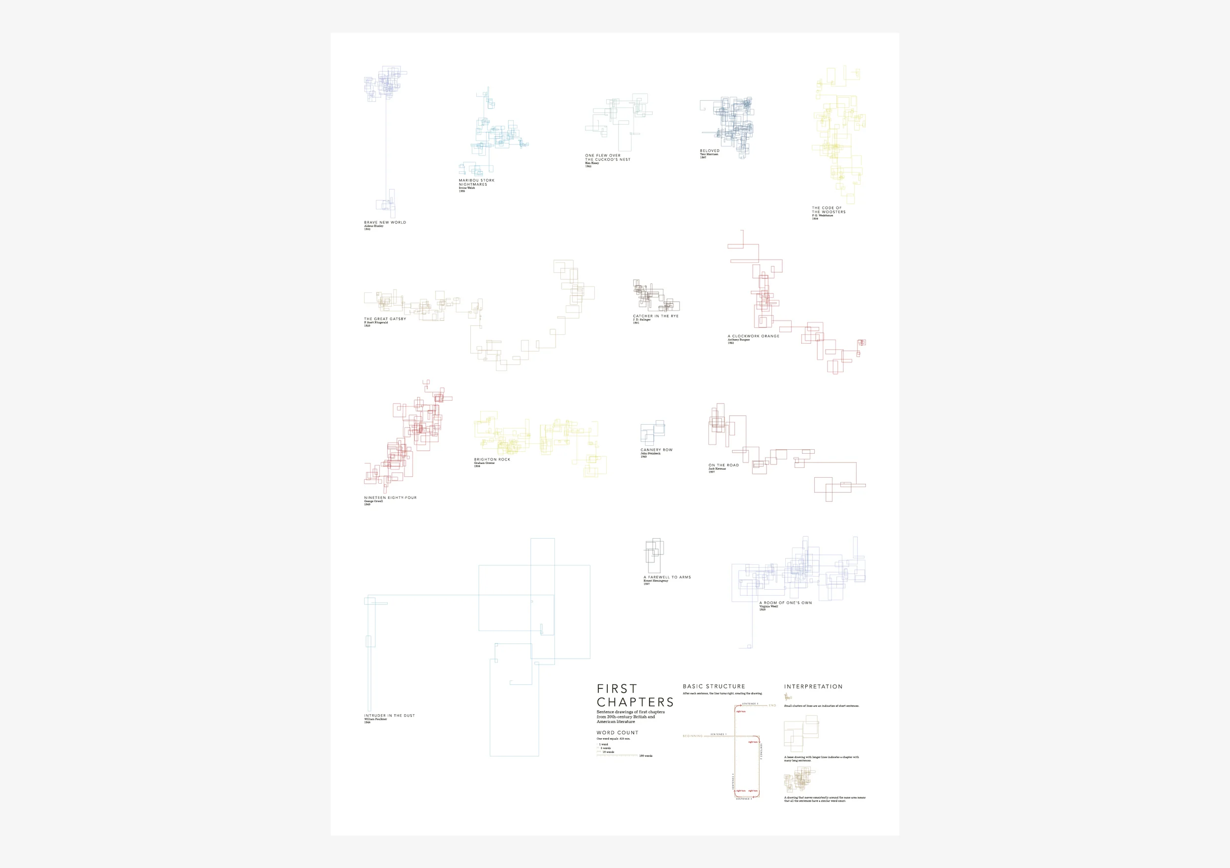
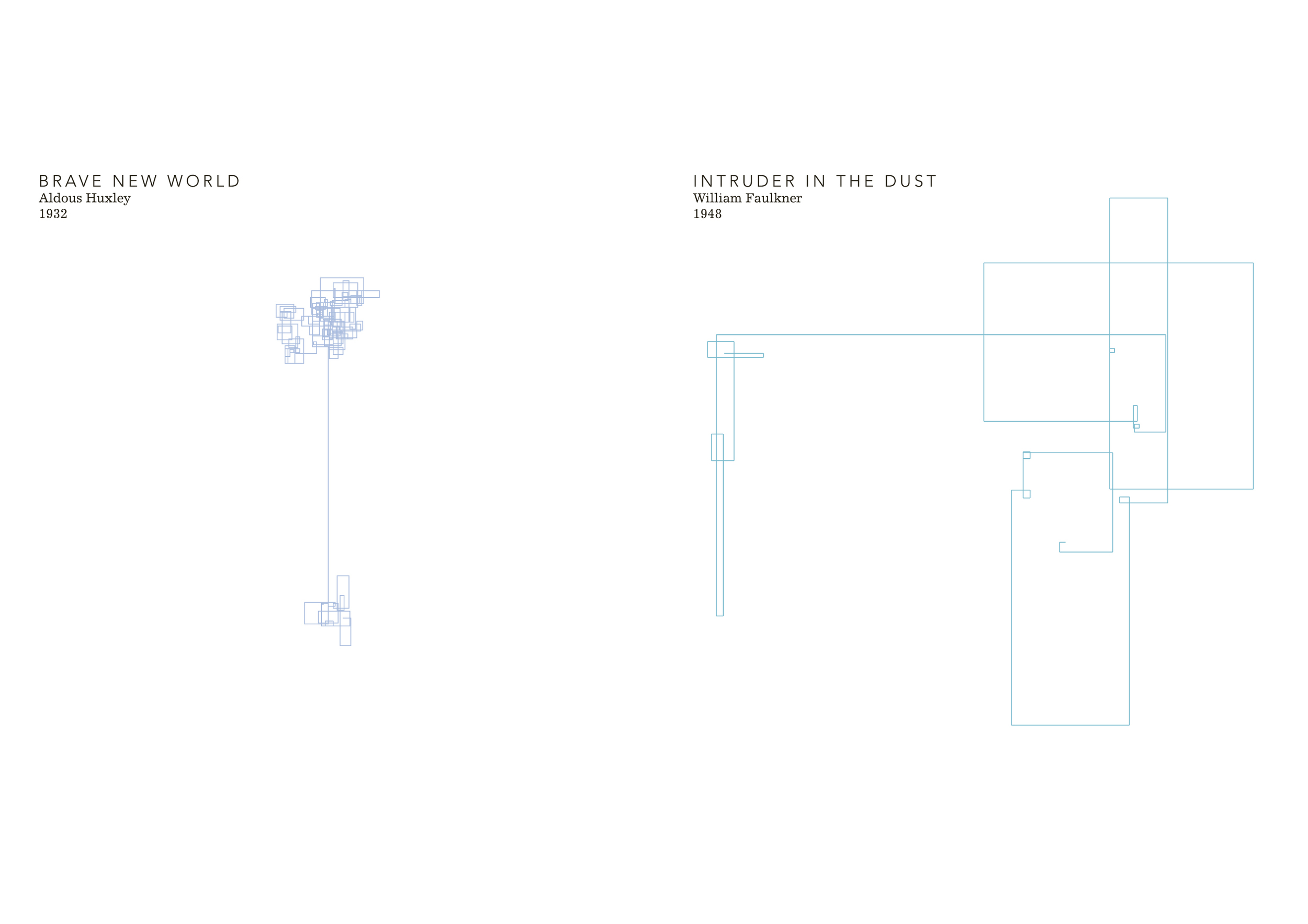
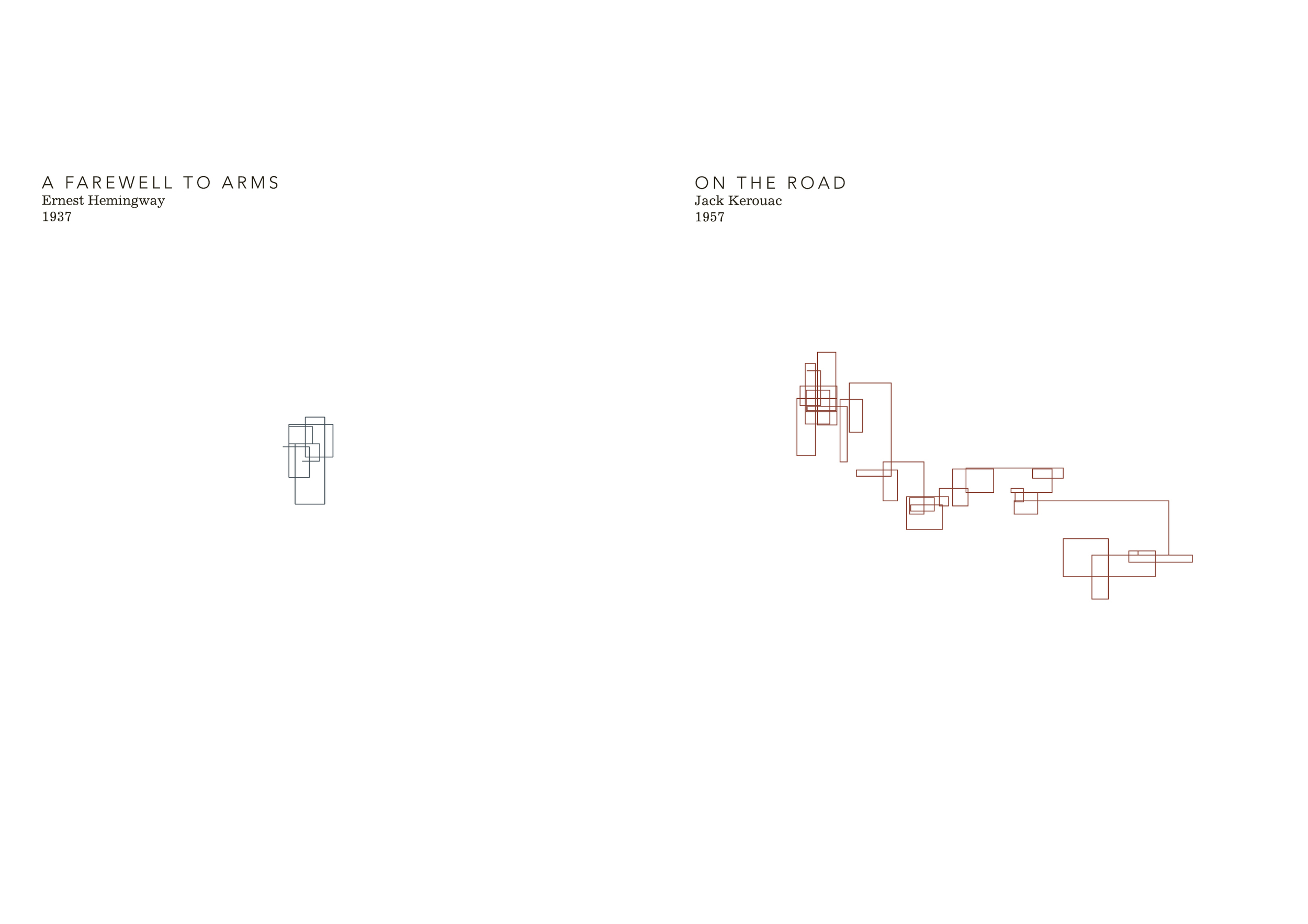
The intention of the project was to explore methods of visually-representing text in order to highlight the similarities and differences in writing styles when comparing different authors. While I focused on 20th-century English-language authors, the main text I chose to work with was On the Road, by Jack Kerouac (a novel important to me when I was a teenager). Sentence length, themes, parts-of-speech, sentence rhythm, punctuation, and the underlying structure of the text formed the data that I then visualised.
While the initial intention of this project was to create a straightforward data visualisation, in the end the project also became an exploration in how the process of data-gathering and data visualisation to know more closely a subject that one has an emotional connection with.


Prints
I created a series of A1- and A0-sized prints that applied the three visualisation approaches I was working with to the text of On the Road.


Books
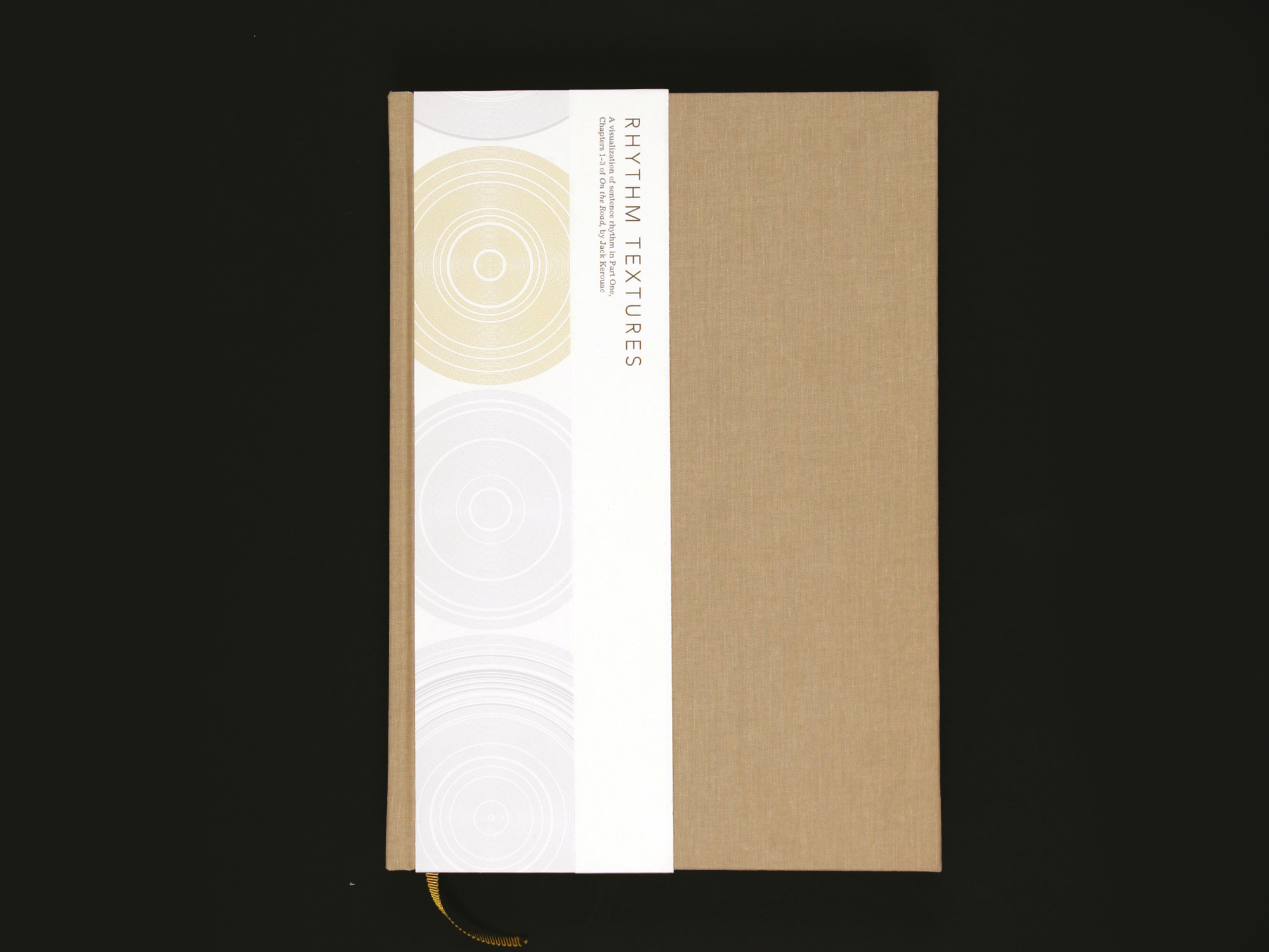
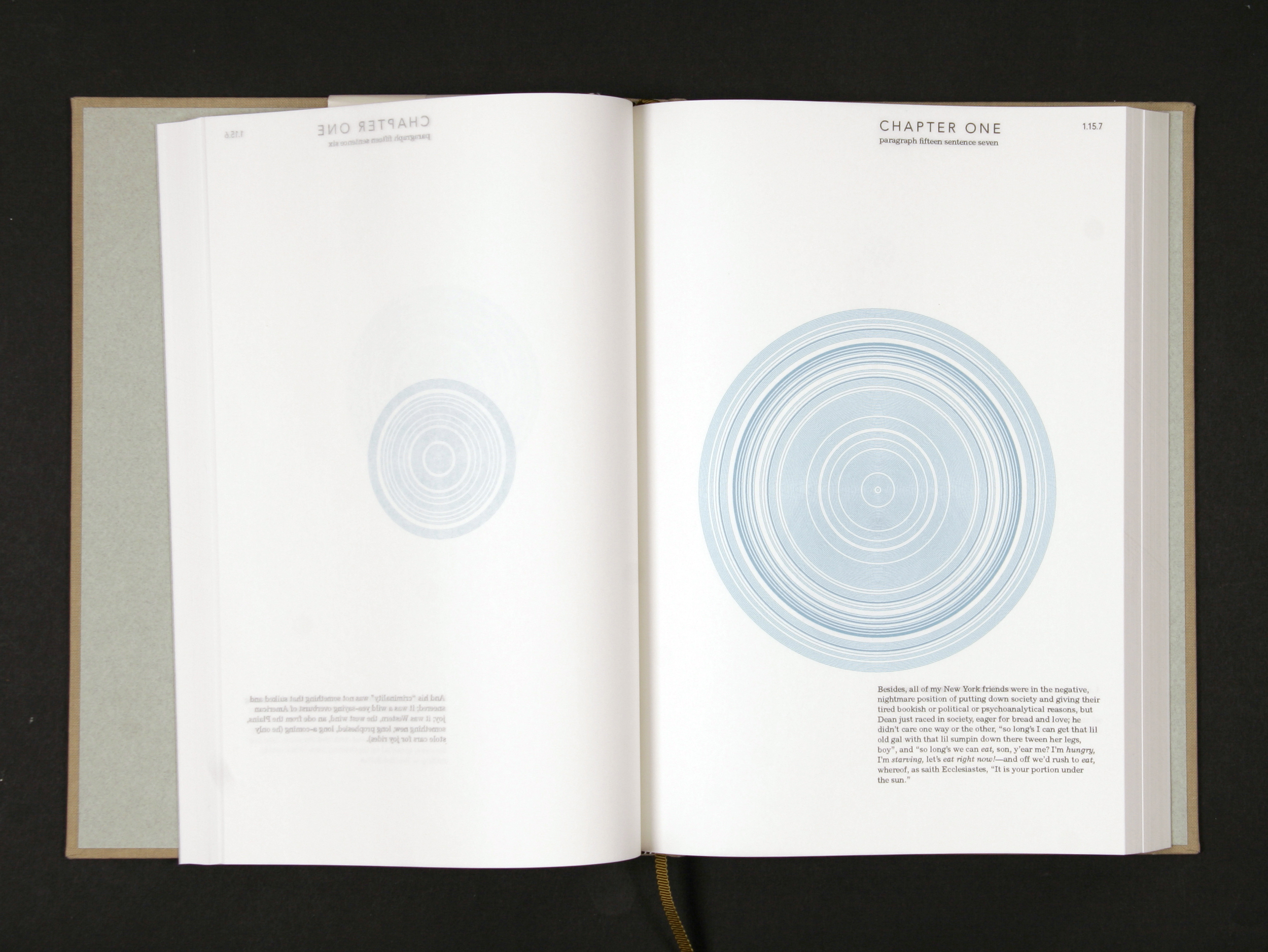
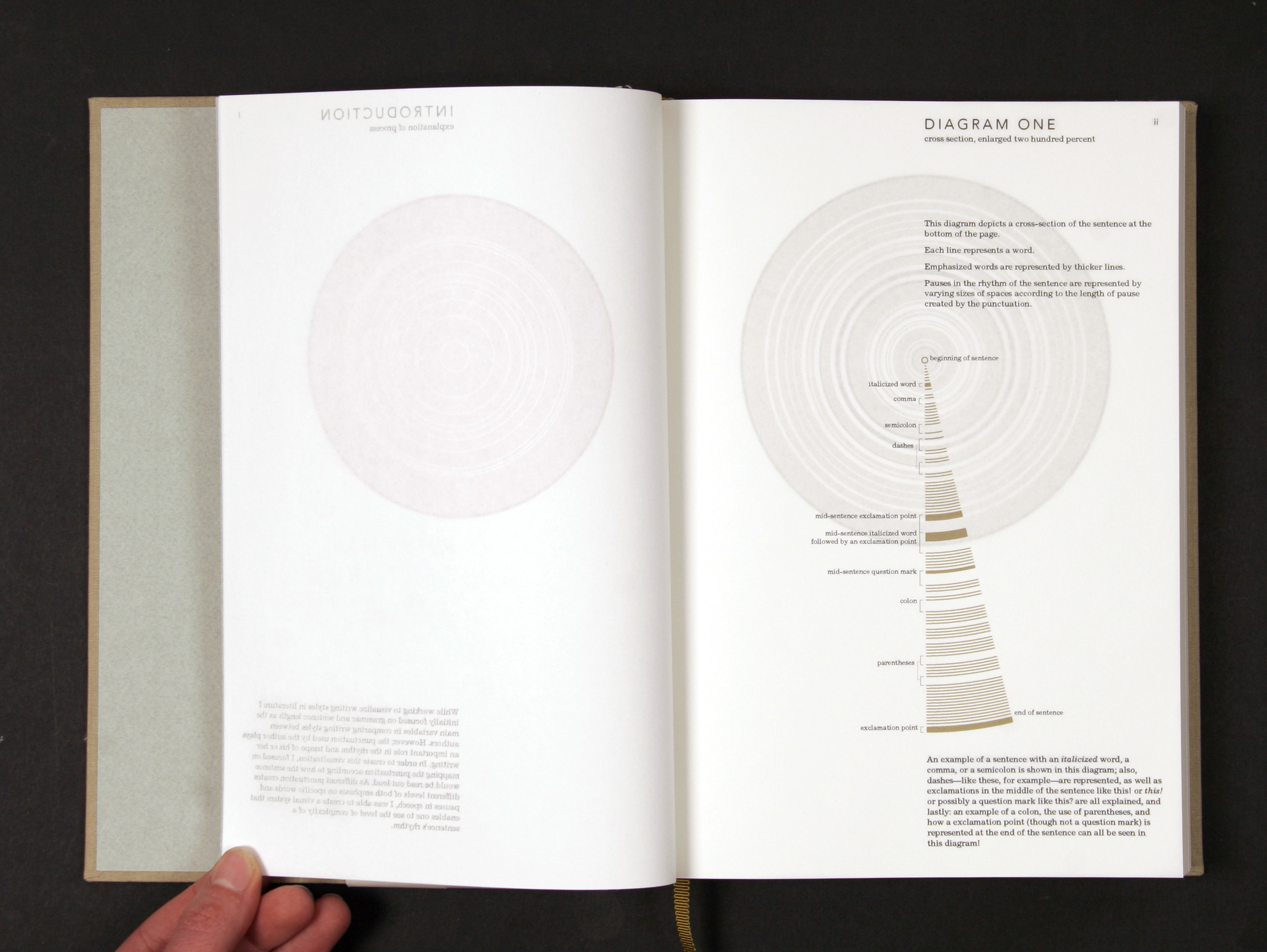
The accompanying artist books (Two books, each an edition of 2) explain the visualisation approaches in more detail.


In-progress
This project was created in an analogue fashion, with data gathered by hand and the final visuals built 'by hand' using Adobe Illustrator. Shown below are artefacts from this handmade approach to visualising data.
In more detail
“Writing Without Words is a project that uses various graphic approaches to analyse the structure and themes of On the Road by Jack Kerouac. When I began this project, I knew that while I was primarily focusing on the analysis of On the Road, I wanted to ensure my final methods of visual analysis could be applied consistently to any other literary work. By applying these approaches to different pieces of literature, visual comparisons of the writing styles of various authors could be made, and the complexity of the structure of their literary works could be highlighted. However, I knew I didn’t want to use expressive typography or imagery to create a subjective representation of the information. Instead, I wanted the graphics to be based on something quantifiable.
However, searching for information that is constant in every piece of literature is difficult, what with the numerous themes, storylines, and words used in all of English-language literature. I realized I needed to gather data that related to the structure of English language instead of working with literary themes as a method of measurement. Using the sentence as the basis for my information visualizations meant I would be able to measure and map quantifiable information that could be found easily throughout the English language.
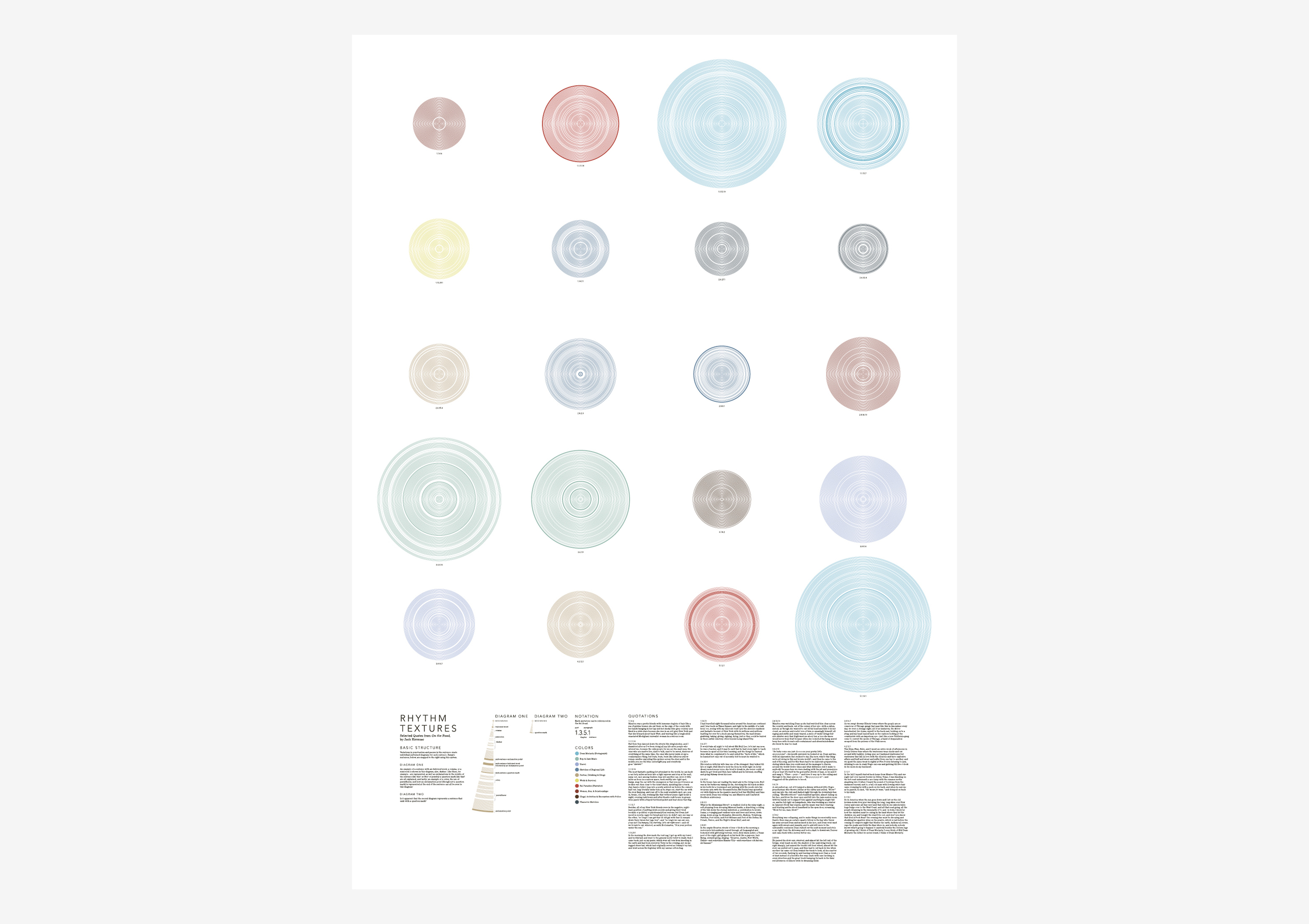
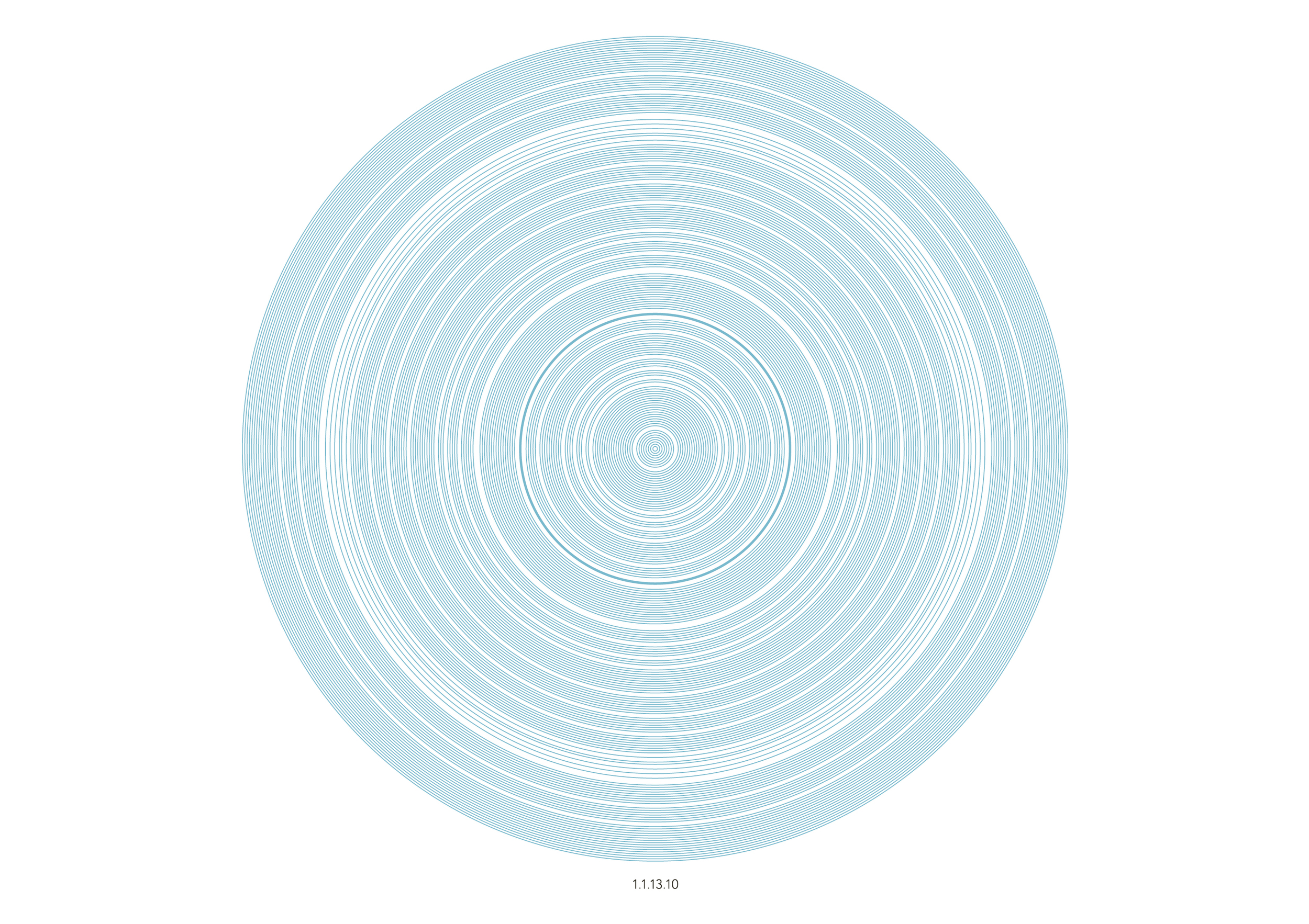
So, gathering numerical data based on the structure of the novel and of a sentence seemed to be the most appropriate solution. I’ve always enjoyed using numerical data to create artwork because one can gather data from any topic and use it to generate graphics that help the viewer look at the subject differently. Also, the use of numerical data emphasises the hidden complexities inherent in the subject and brings them to the attention of the viewer.
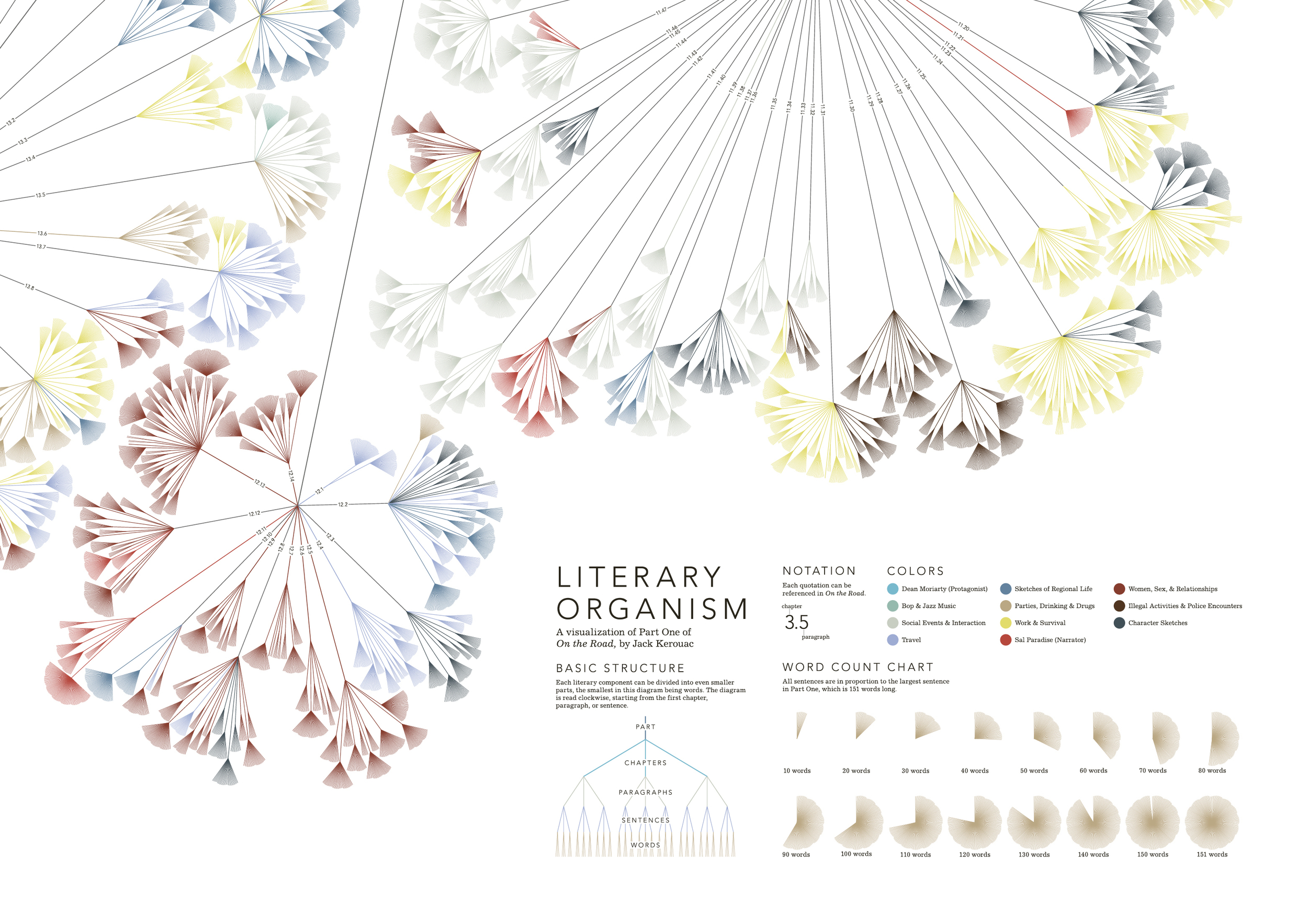
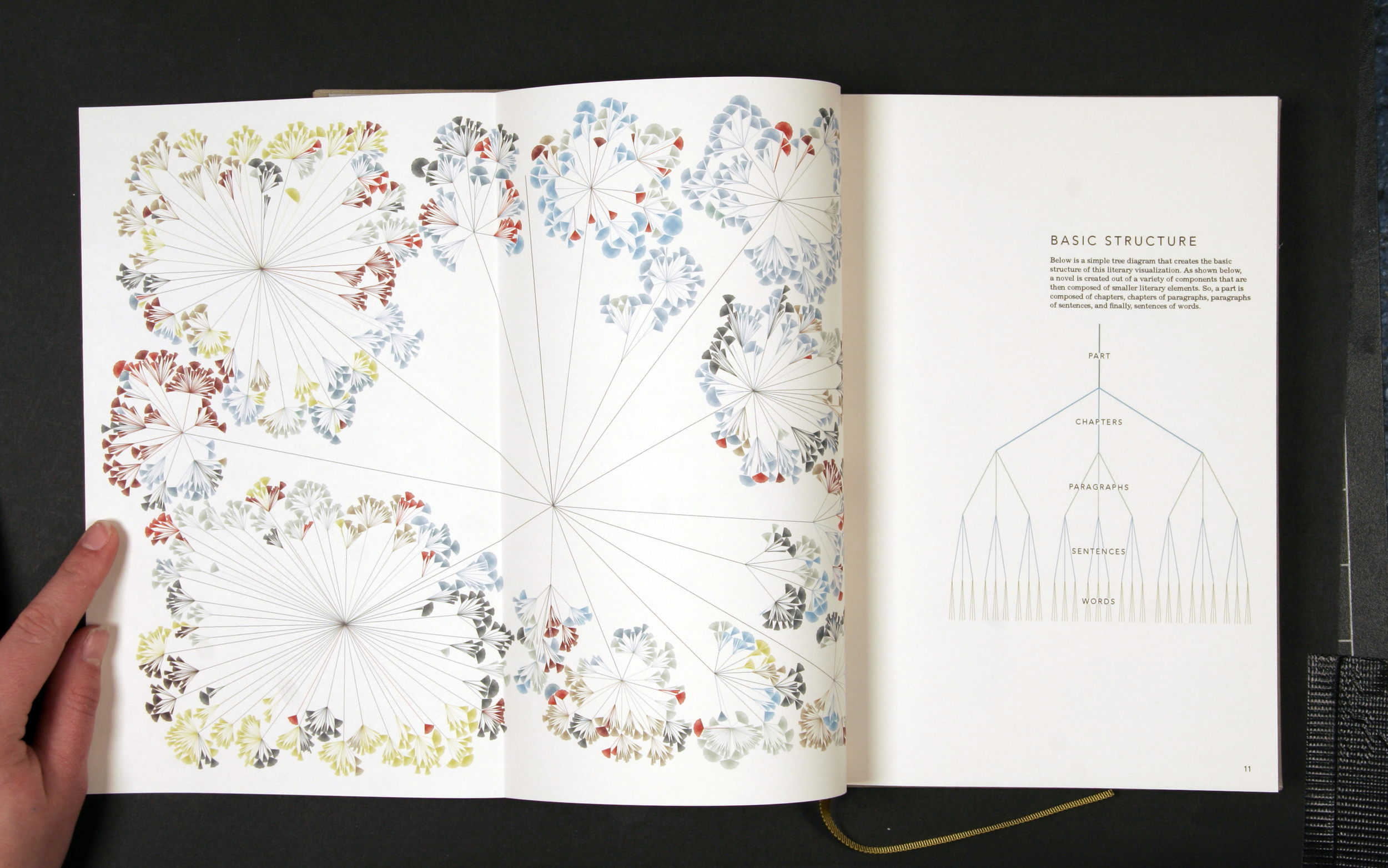
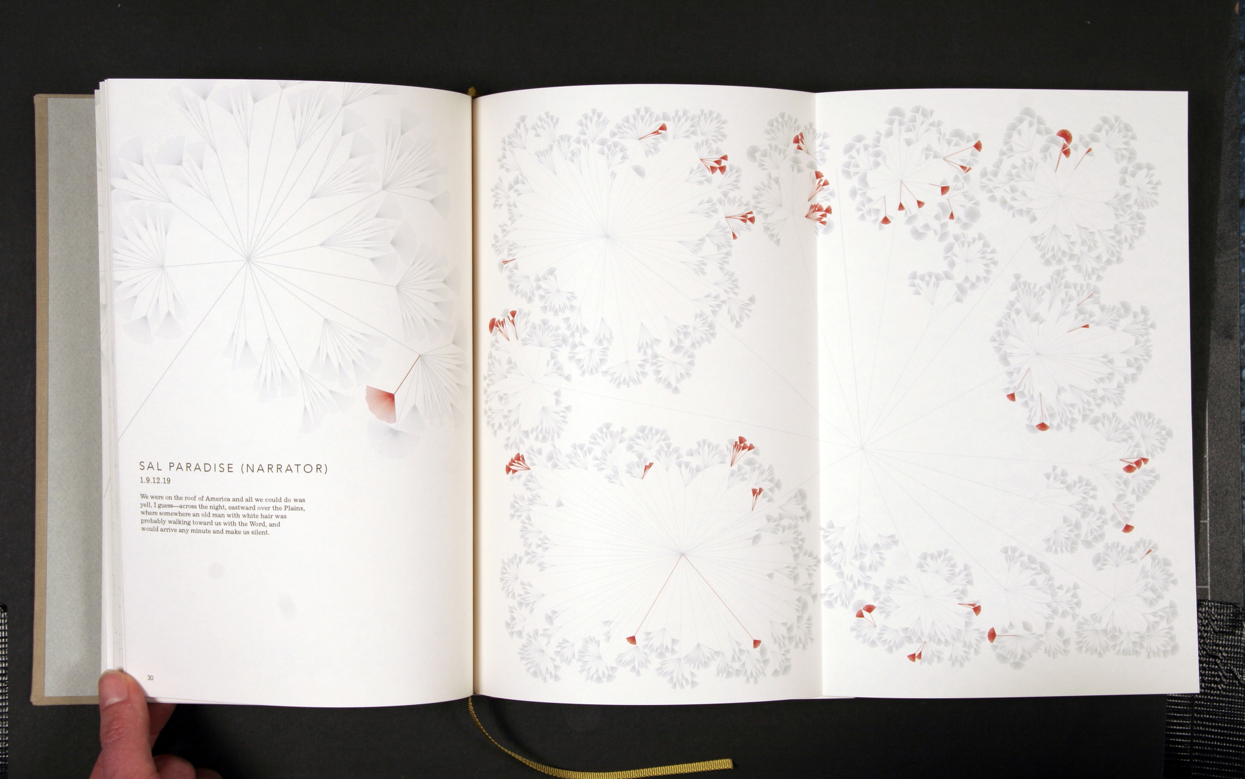
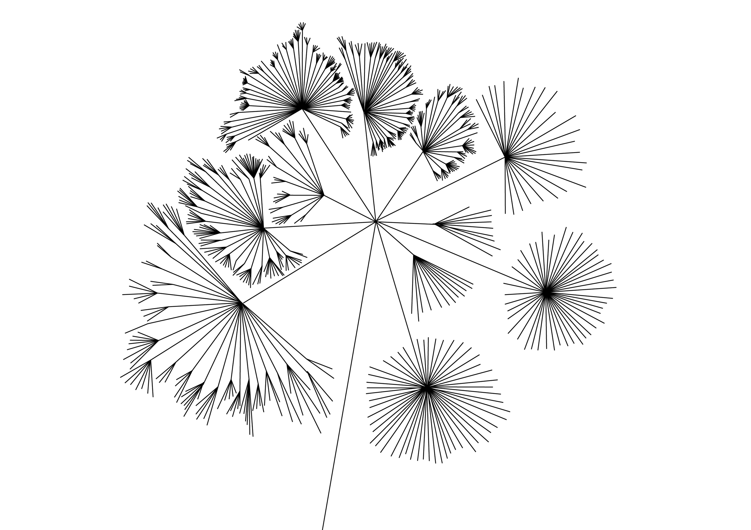
One method I used to gather data looked closely at the basic structure of the novel. I liked the idea of visualising the structure of a novel as a living, breathing thing full of energy and vitality, and this intent was the basis of my “Literary Organism” visualisation. Here, a tree structure is used to show how Part One of the novel is split into chapters, chapters are split into paragraphs, paragraphs are split into sentences, and sentences are split into words. The outcome is a cellular, plant-like structure.
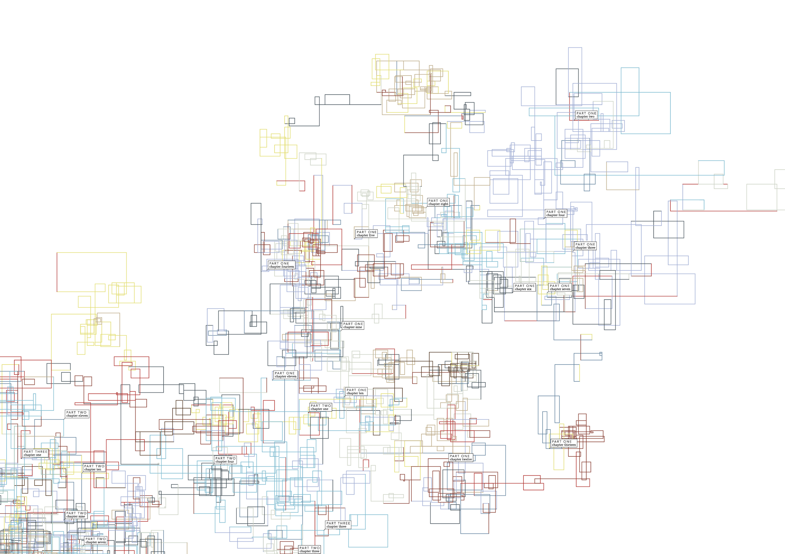
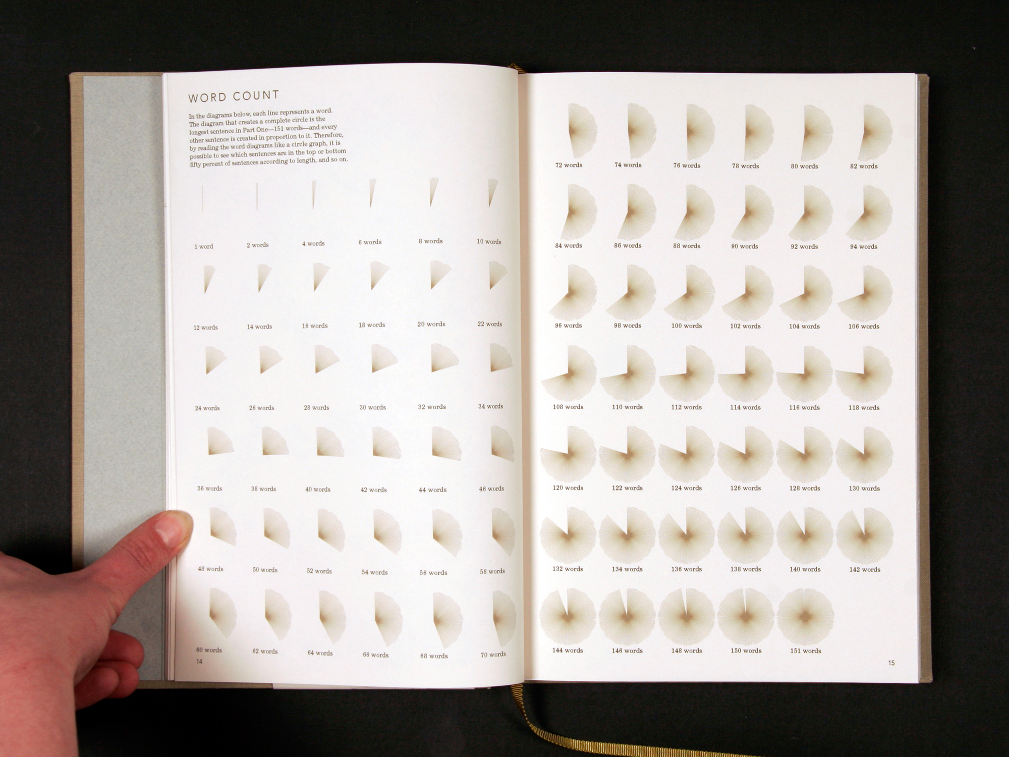
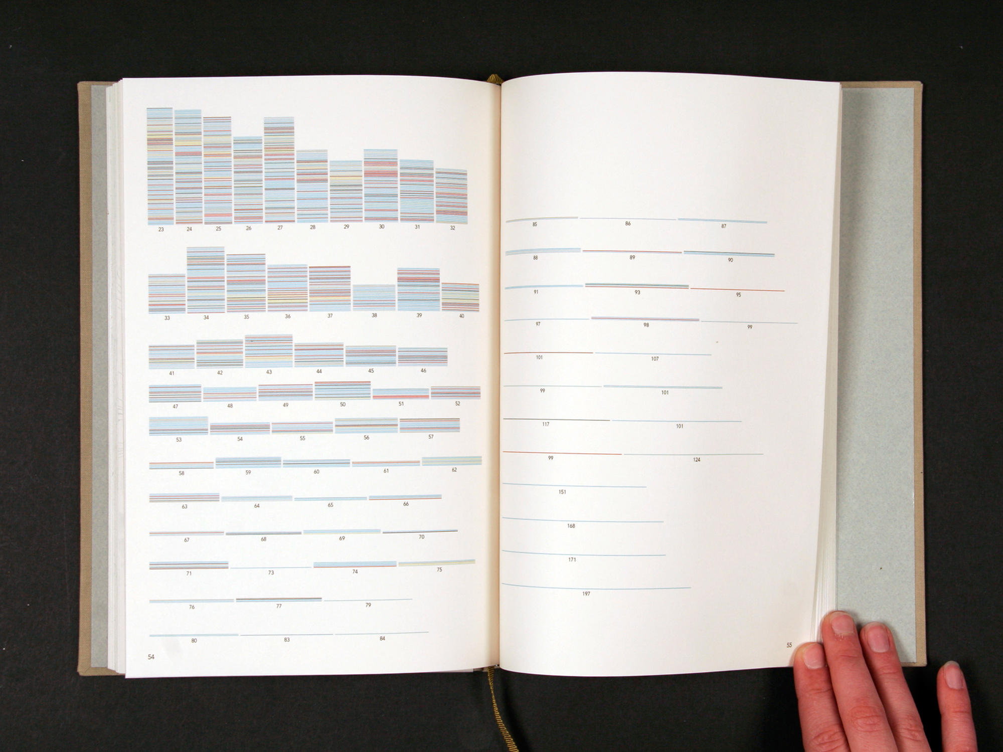
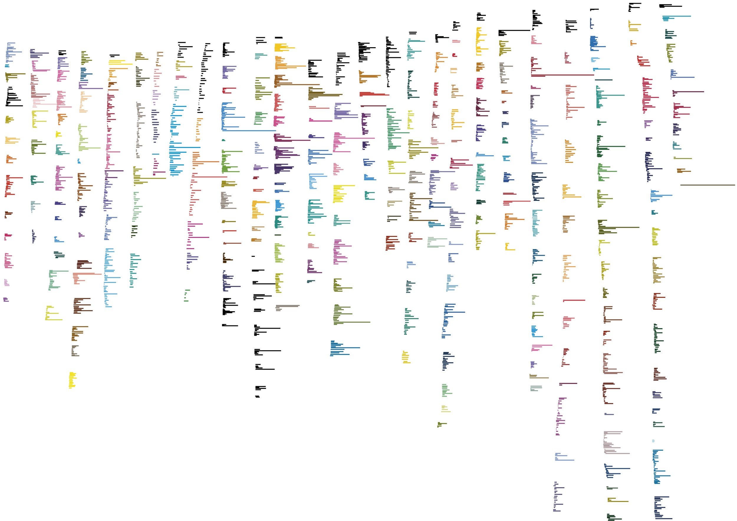
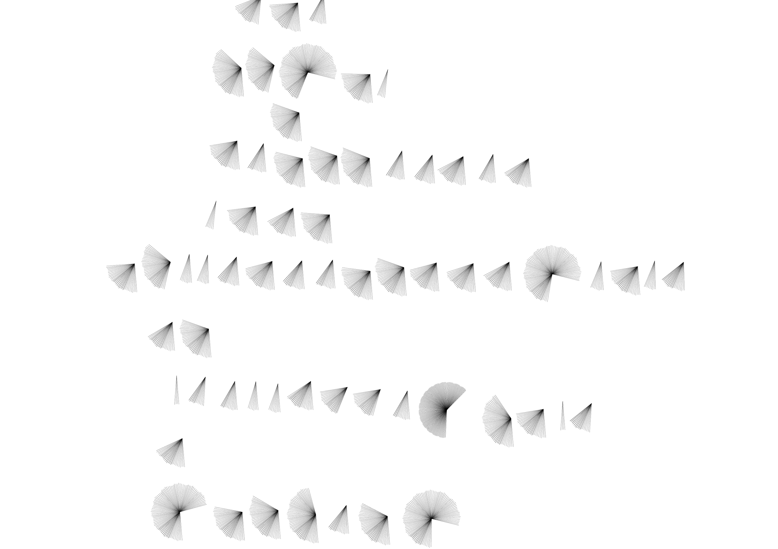
Another approach I used dealt with my observation that the number of words per sentence varies depending on the writing style of the writer. Shorter sentences mean the writer has a choppy, terse writing style, and longer sentences imply that the writer has a free-flowing writing style that undulates across the page in a leisurely manner. I used this information to create a system where a line would turn right after each sentence (scaled against each other by the number of words per sentence), and this would create an Etch-a-Sketch-style graphic that I call a “sentence drawing.” In this approach, one can visually discern whether the writer uses longer or shorter sentences.
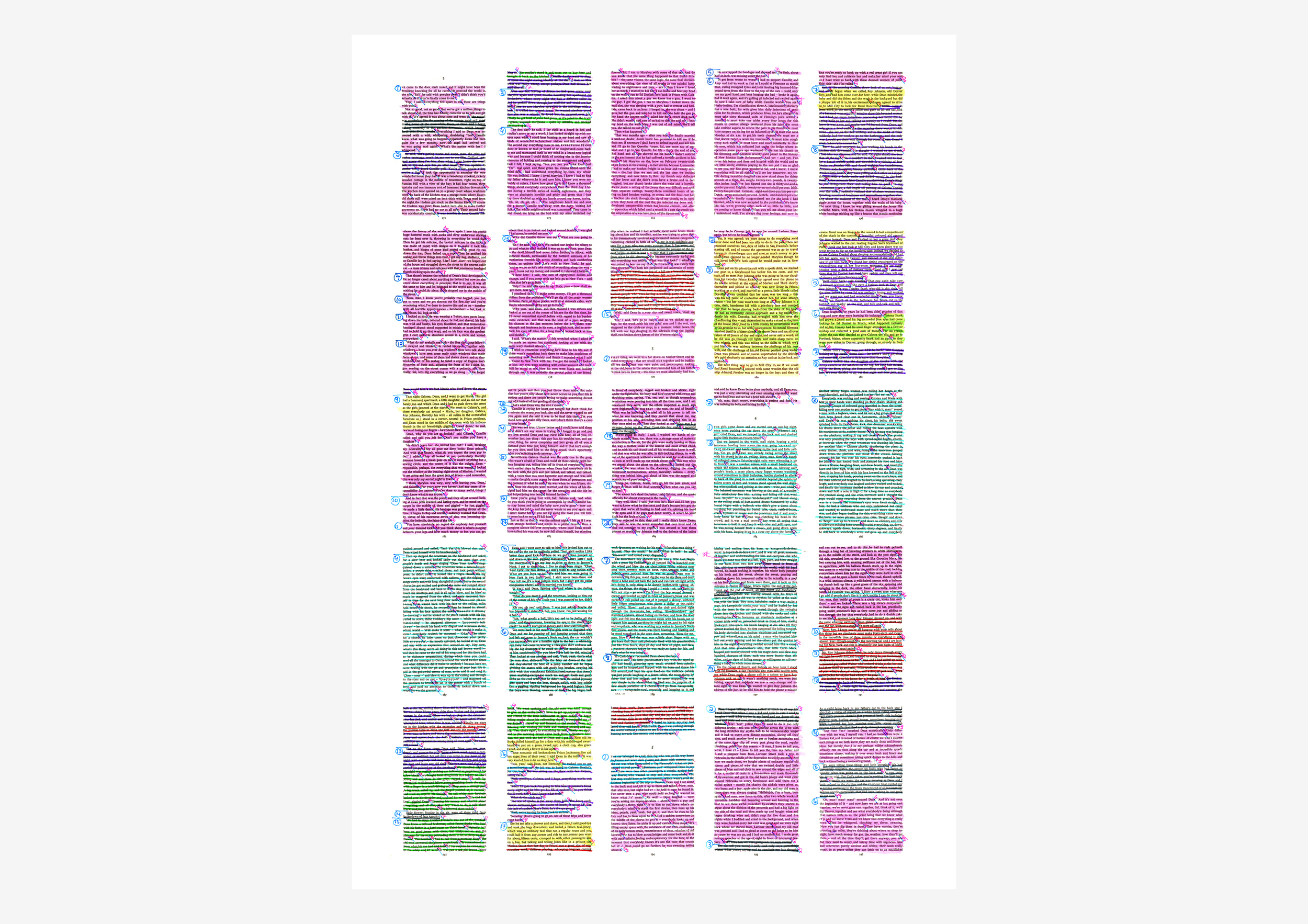
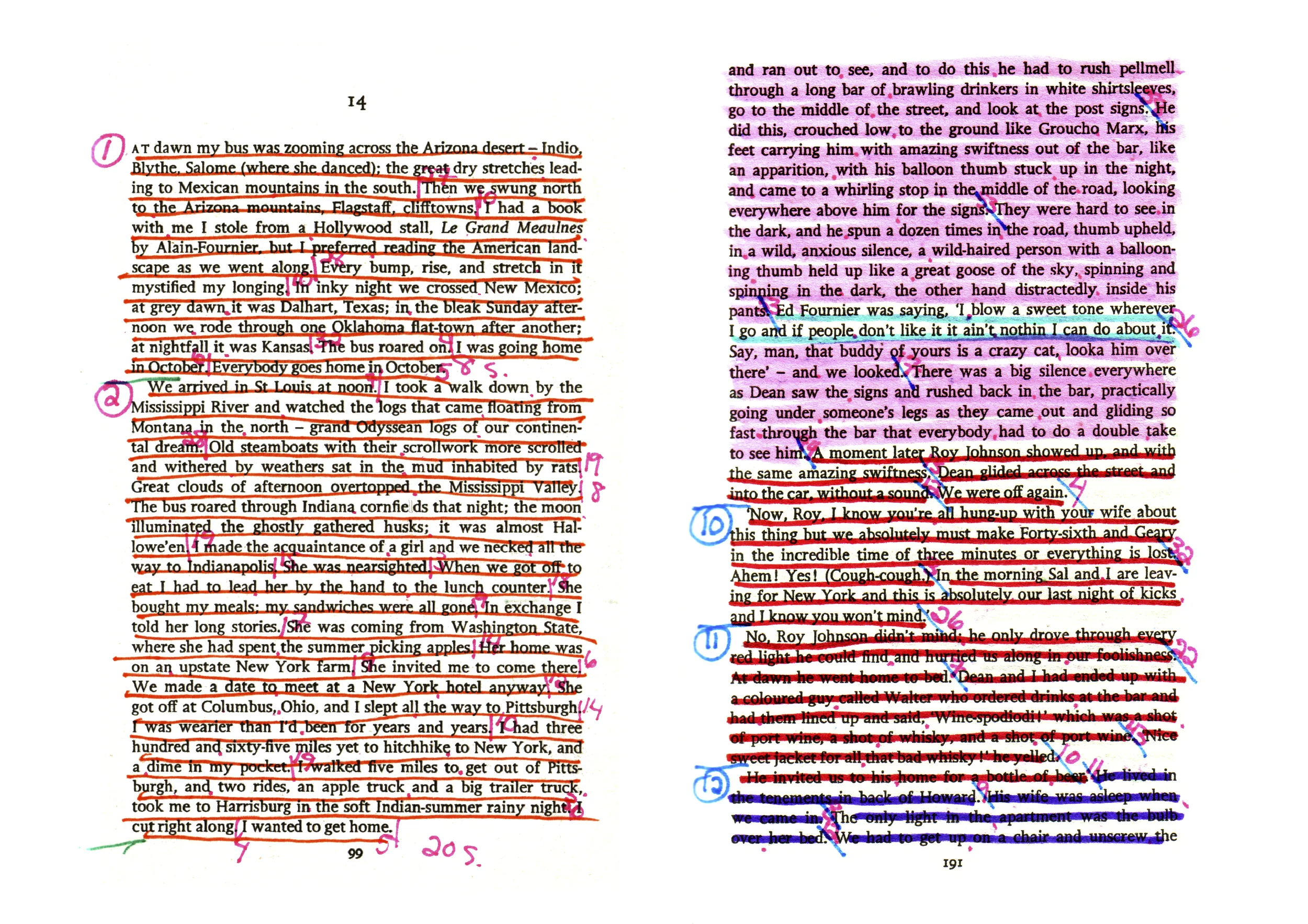
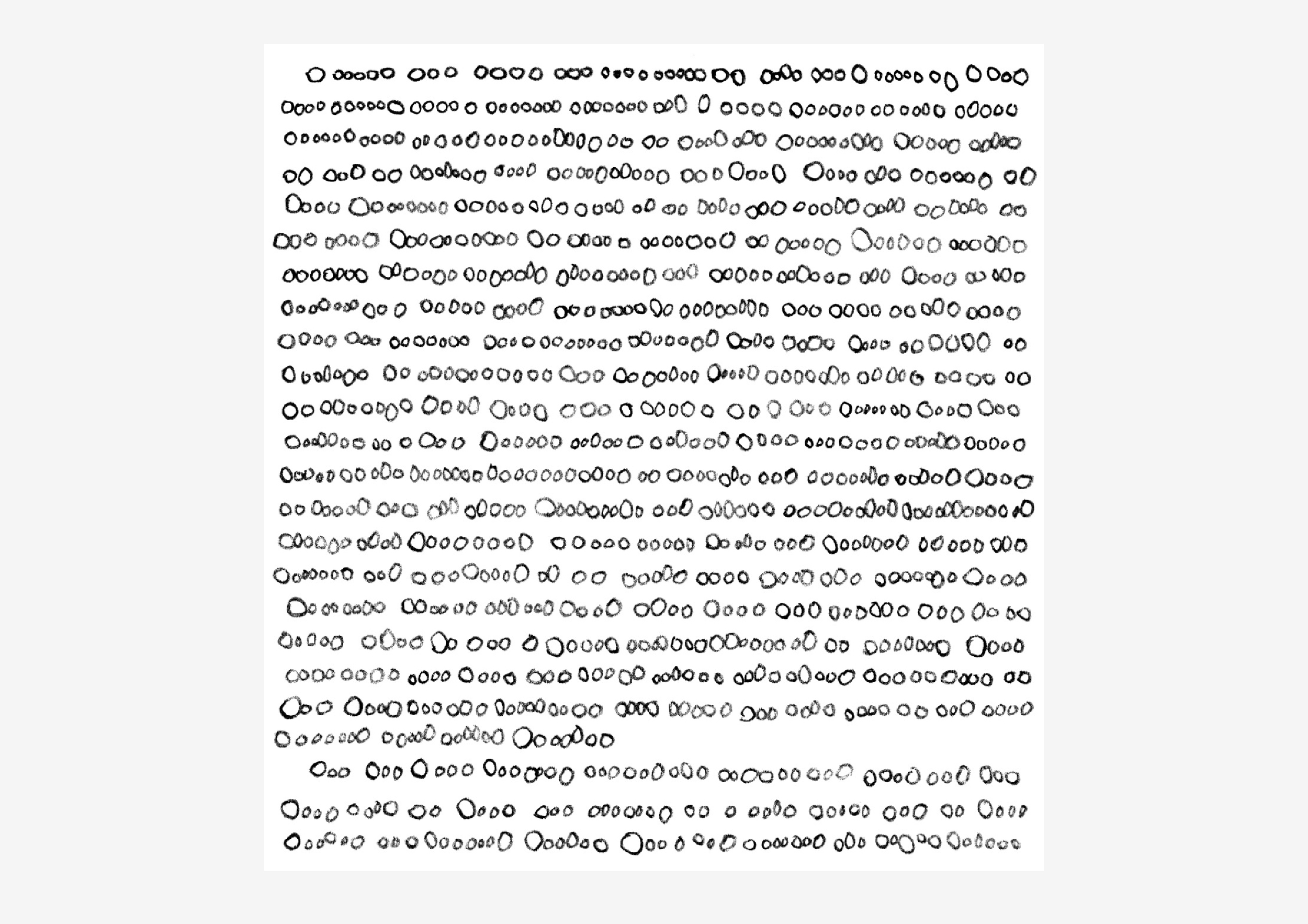
For this project I gathered all of the data by hand, counting words and sentences, and carefully dividing a battered copy of On the Road into key themes using markers and highlighters. I was able to reduce the entire novel into a stack of paper filled with lists of numbers, a process of compression I found incredibly satisfying. Using simple arithmetic and a calculator, I would complete equations and re-check the final sums, much as one would balance their checkbook. The graphics were also created by hand in a computer graphics program instead of using an information visualization program. I appreciate this process as much as I enjoy the outcome of the project, watching as the graphic slowly begins to generate itself bit-by-bit instead of appearing instantaneously before my eyes, as it would have done had I used an information visualisation program. By creating work in this way, the handmade, craft element comes through in the creation of information graphics. Some people knit scarves while watching television; I, on the other hand, knit together information visualisations. The obsessive tendencies needed to create this work and the emphasis on labor add to the importance of the graphics, something that would be lost had I created the work by merely pressing “enter” on a keyboard. ”
Purchasing Prints
I sell unsigned, non-editioned prints of this project on-demand through Imagekind (based in the US). Click on the links below to be taken directly to the best configuration for each print (they automatically add framing to the price, so just remove this).
All prints are configured to print on the least expensive paper (Enhanced Matte). Feeling flush? Then select the UltraSmooth Fine Art paper instead:
Literary Organism (48 x 36 in.)
Rhythm Textures (48 x 36 in.)
Sentence Drawings Poster (48 x 36 in.)
First Chapters (32 x 24 in.)
Sentence Length (32 x 24 in.)
Highlighted Pages (32 x 24 in.)