Data Murmurations: Points in flight (People Like You)
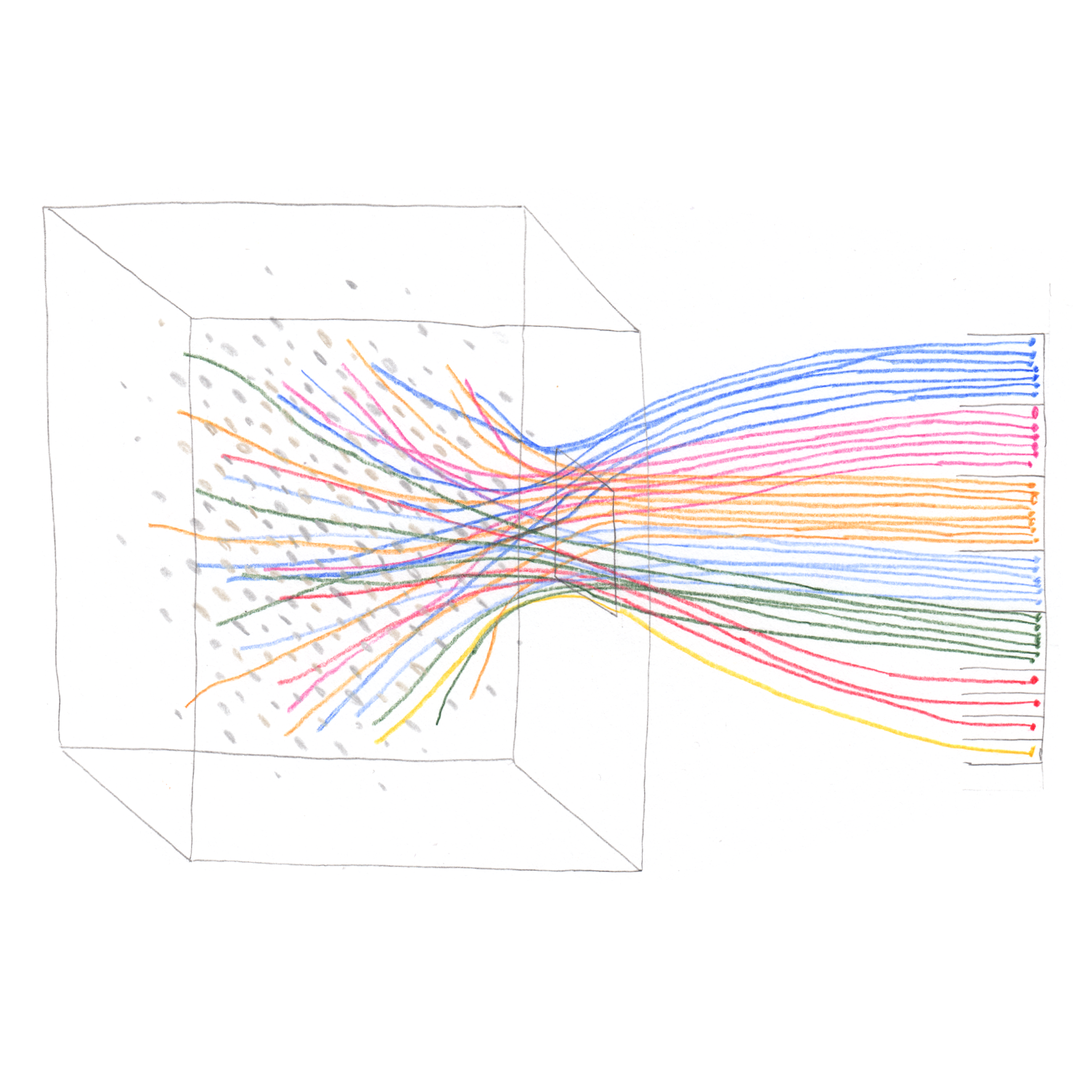
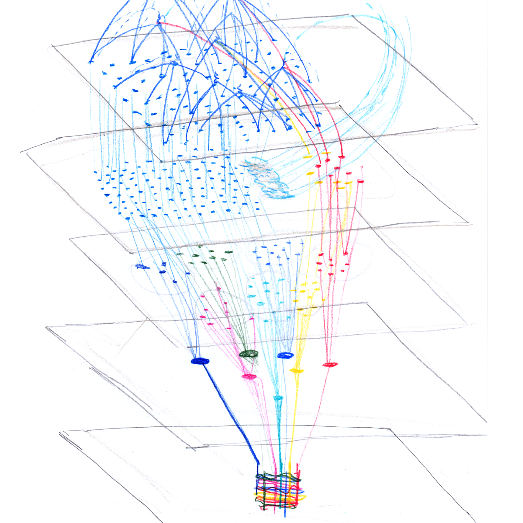
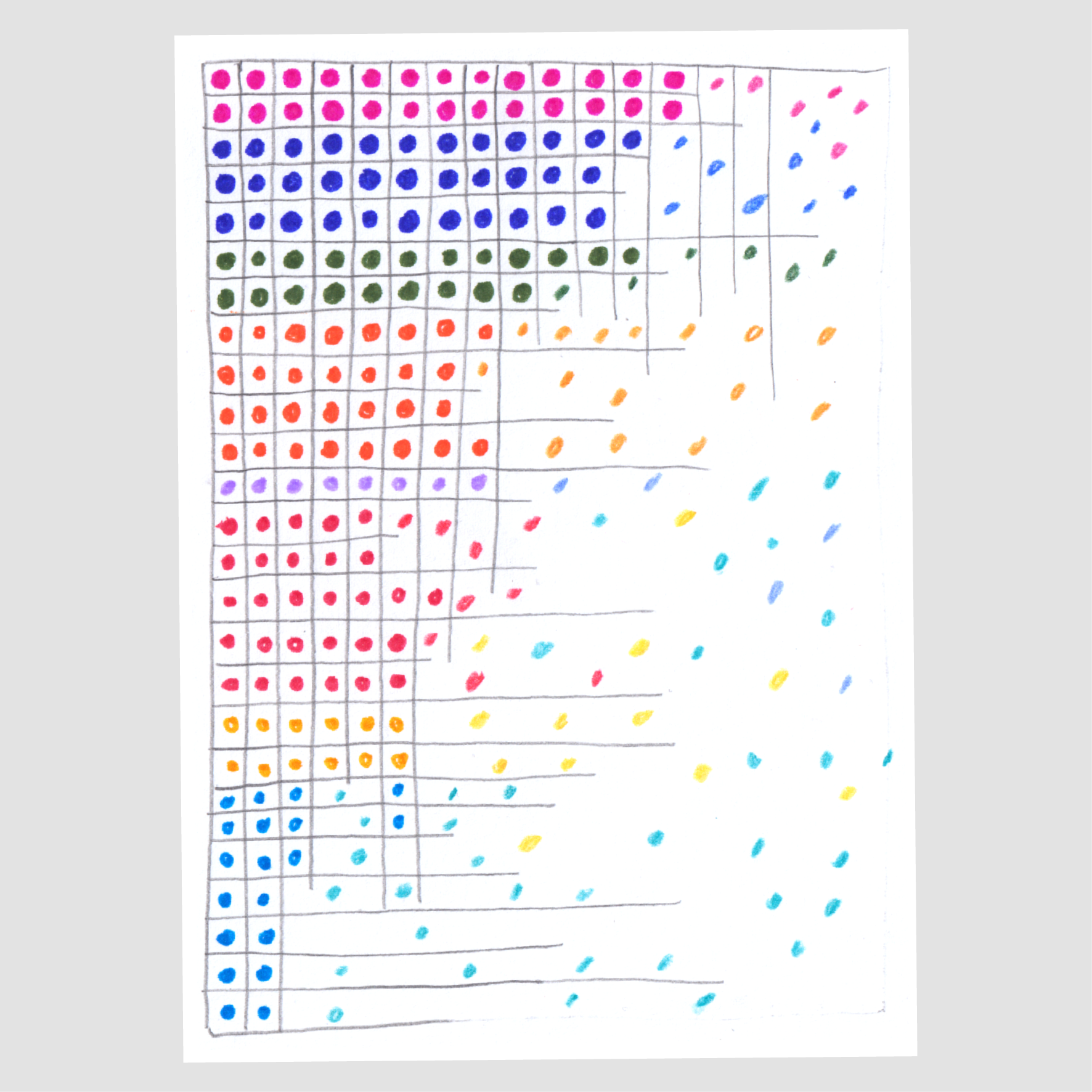
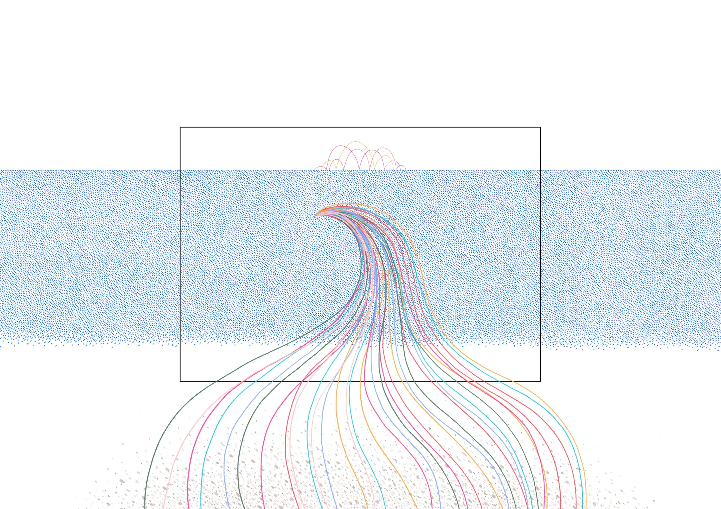
Map of the Airwave study system
For the majority of my career, my projects centred around the visualisation of a specific dataset, where the work’s aesthetic and message are created through faithfully translating every data point into graphic elements and visual form. However, I've recently started working with data in a different way, where instead of working only with data visualisation I am instead exploring how to visualise the processes of acquisition, preparation, storage, and analysis inherent in every dataset.
When visualising these data processes, I don’t work with actual datasets but instead use the visual language and design processes of data visualization to ‘visualise’ hard-to-define concepts and processes with blurry edges that aren’t as precise as ‘hard’, quantitative data.
This way of working with (but not working with) data started during my recent ‘art as inquiry’ residency with the UK research group People Like You, a group that is looking at the outcomes and consequences of data personalisation. During the residency I was working under Helen Ward at Imperial College, creatively exploring how data is used to personalise medicine.
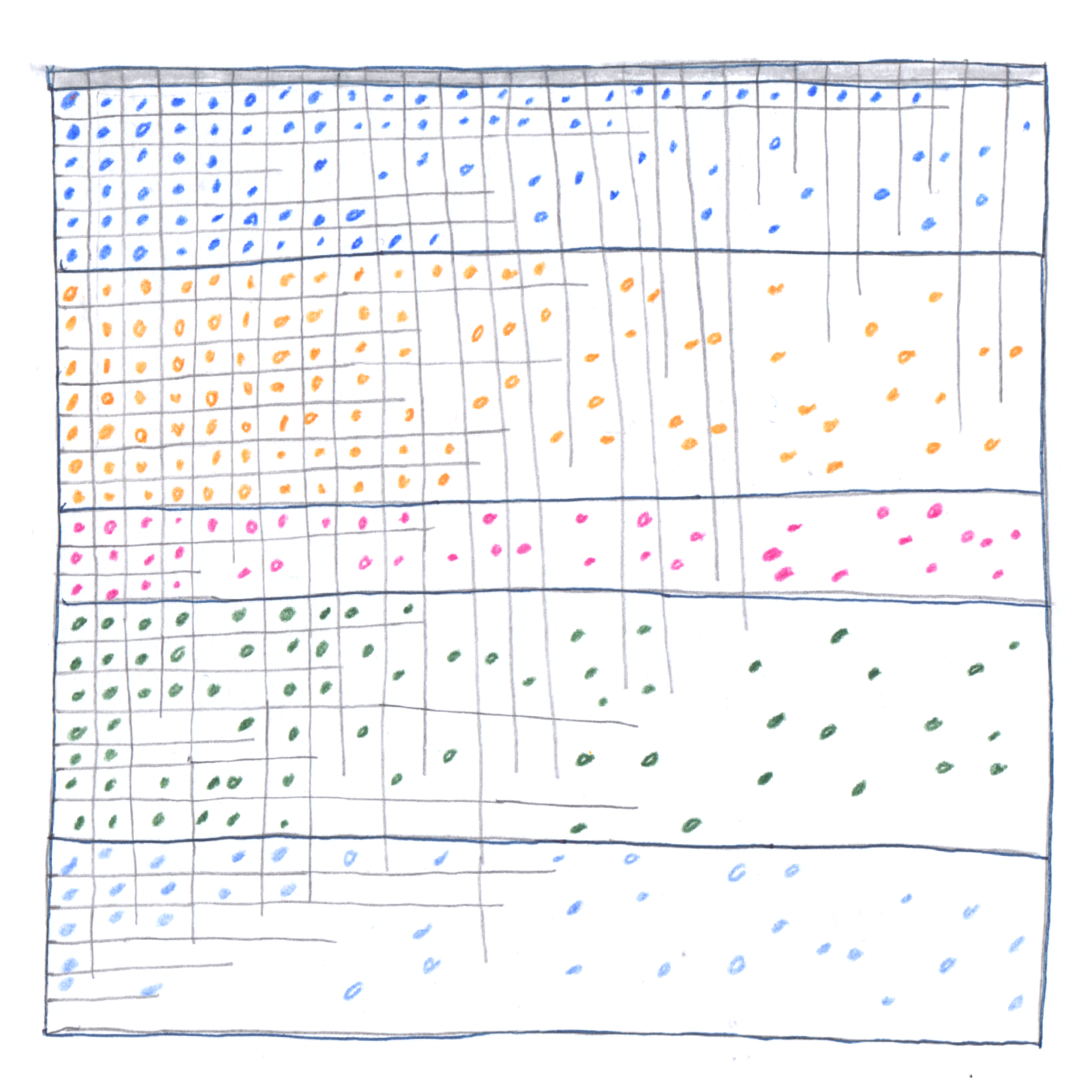
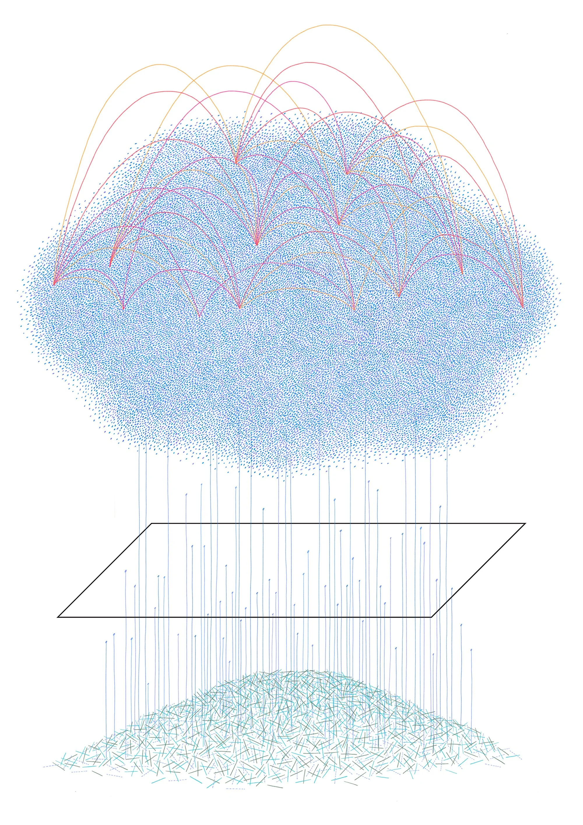
For my residency I investigated how the various stakeholders within a biobank perceive the ‘people behind the numbers’ who consent to their biological samples and data being used and stored for research. My focus was on the participants and researchers of the Airwave Health Monitoring Study, a cohort study and biobank based at Imperial College that’s been following the lives of 53,000 members of the police force since 2003.
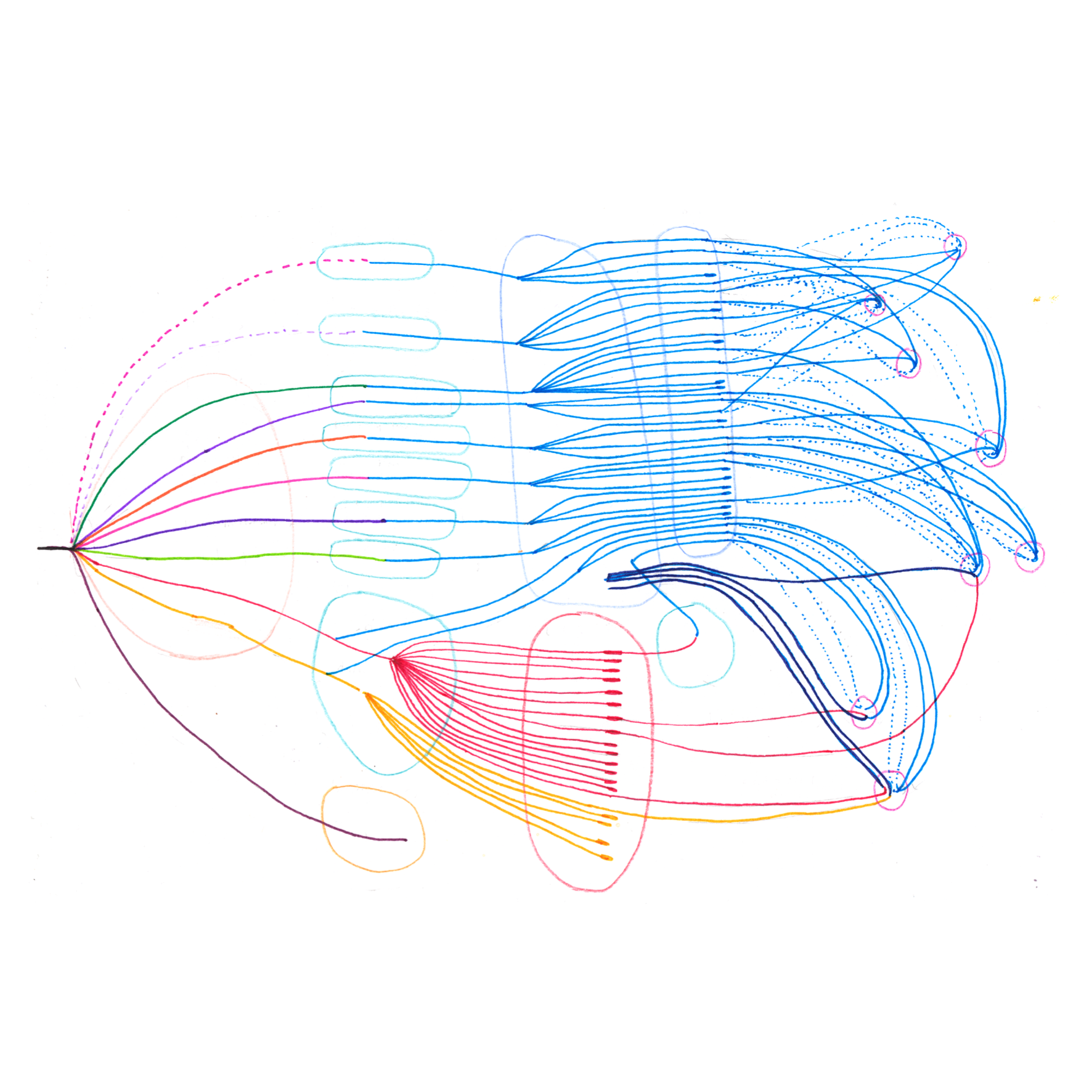
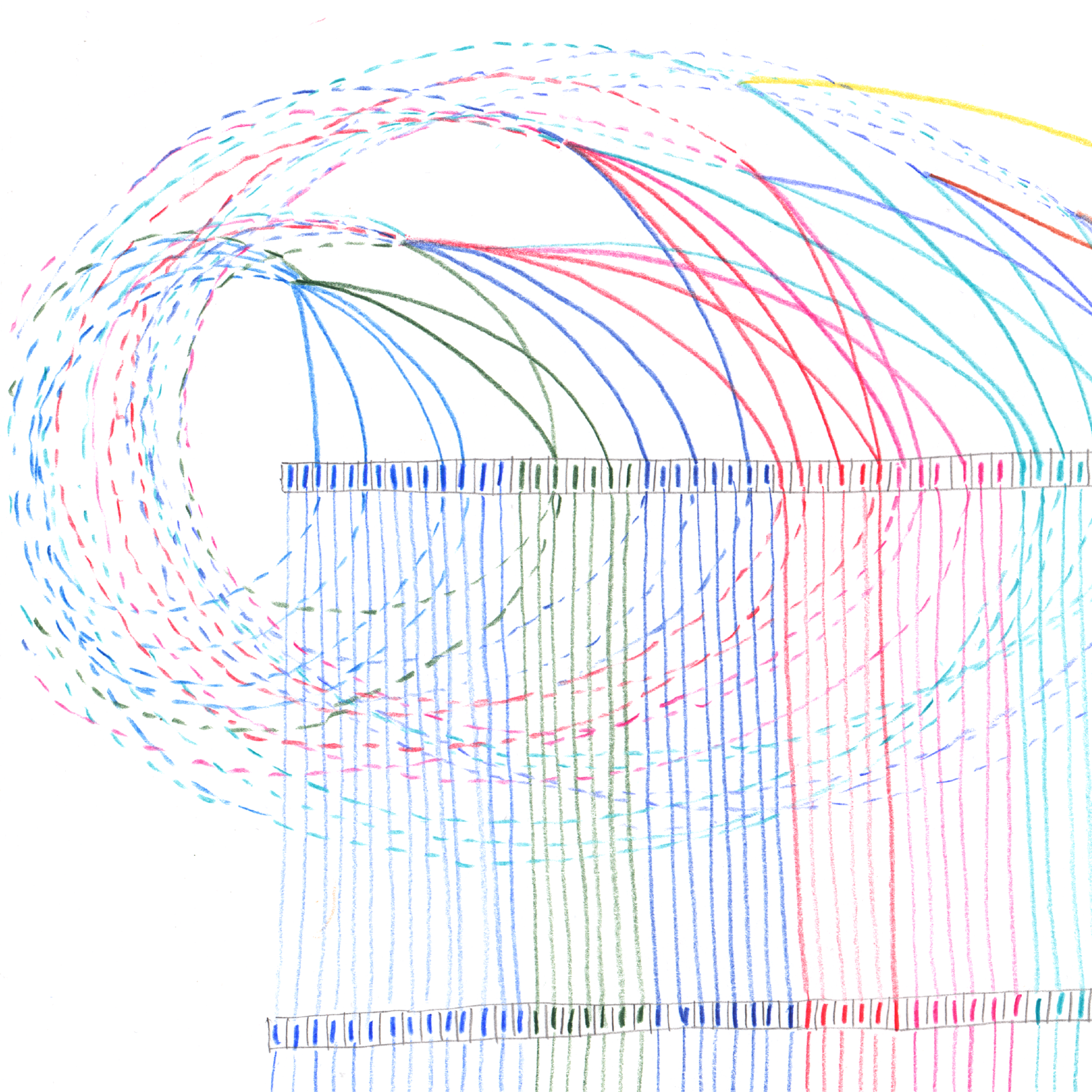
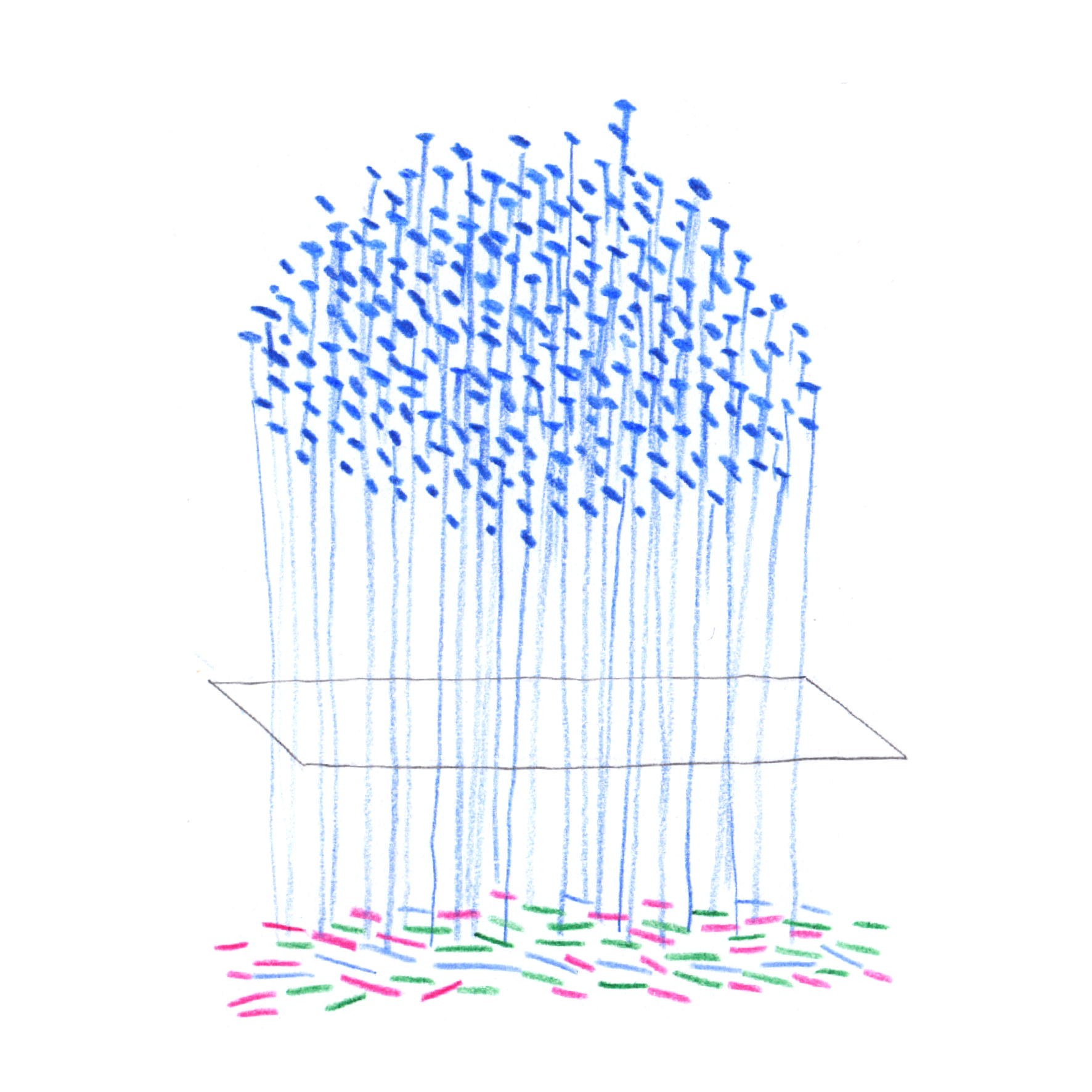
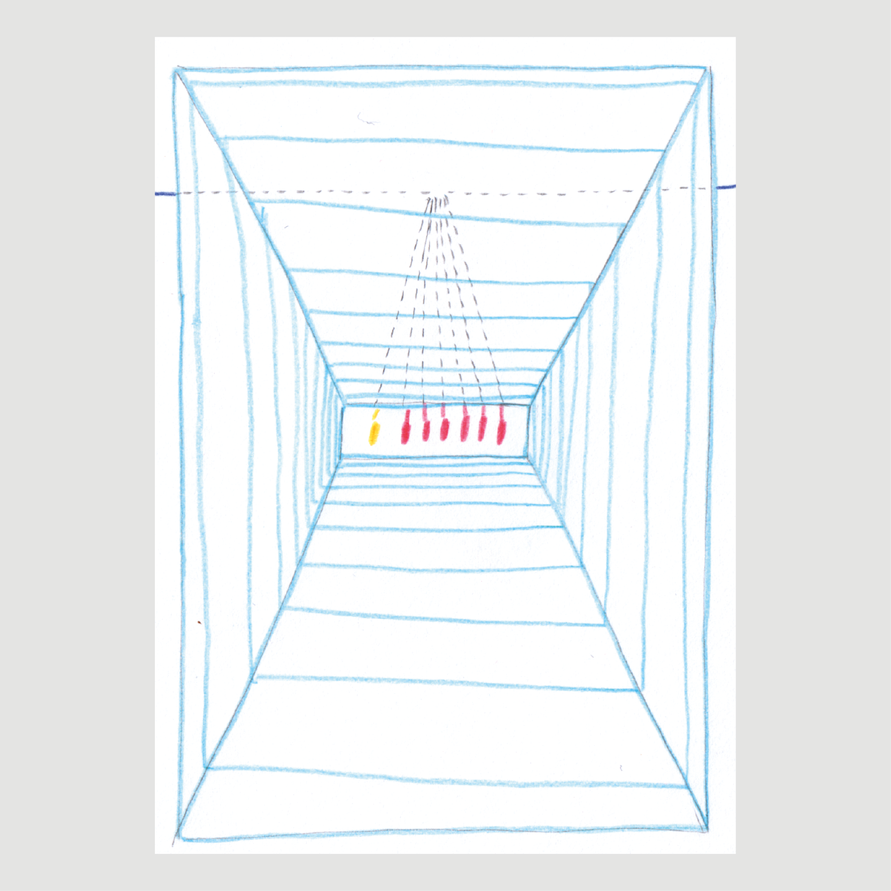
After interviewing Airwave’s staff and study participants, I created a detailed, drawn map of the winding journey a participant’s biosamples and data take within the study, alongside which I also created a series of drawings that present the various perspectives of study stakeholders from their ‘positions’ within the Airwaves system, showing how their ability to ‘see’ the individual participant within the aggregated data changes depending on where they are located within the study system.
During this residency, I couldn’t access any study data (alas, making an artwork isn’t a valid research reason to use such sensitive data!) so instead of starting with a dataset, I started with drawing. Drawing became my way to understand and ‘figure out’ all the working parts of the Airwave system, where I built a unified visual language that, in different combinations, was used to ‘visualise’ every part of the study’s data acquisition process.
With these ‘artistic diagrams’, I made sure that I was faithfully presenting whatever data and information that I had discovered, but also accepting that my end result might not have the precision inherent in visualising ‘hard’ data. Here, creative license and subjectivity become tools in finding ways to communicate these invisible data processes.
Artwork created from interviews of study stakeholders


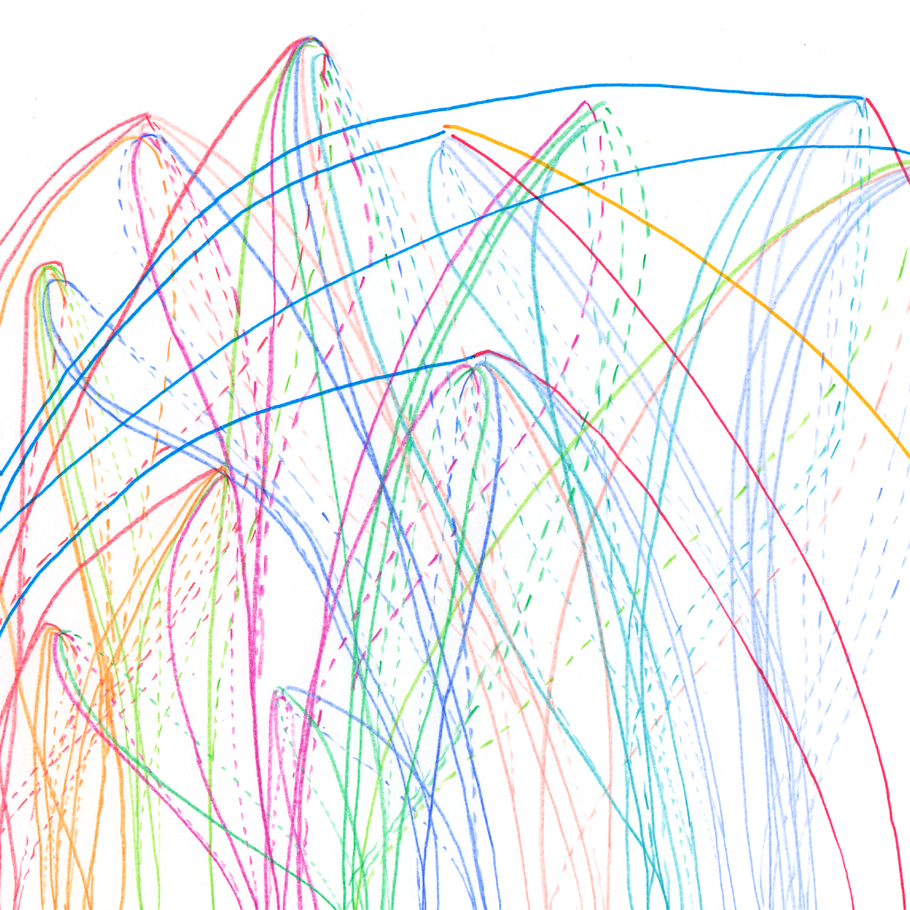
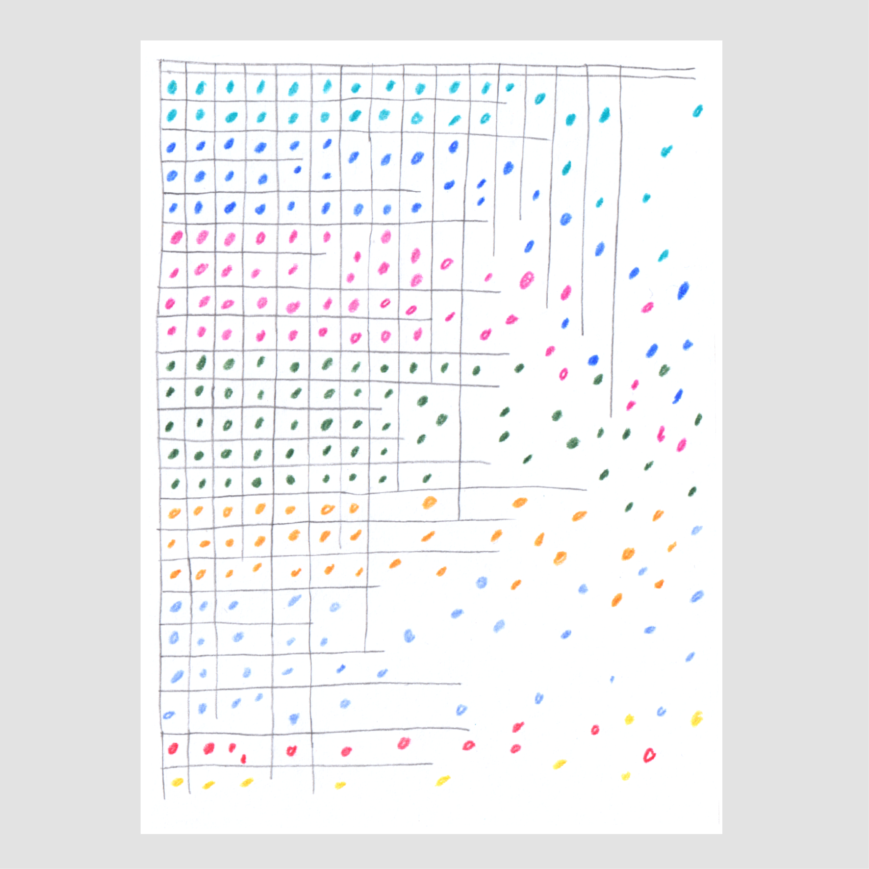
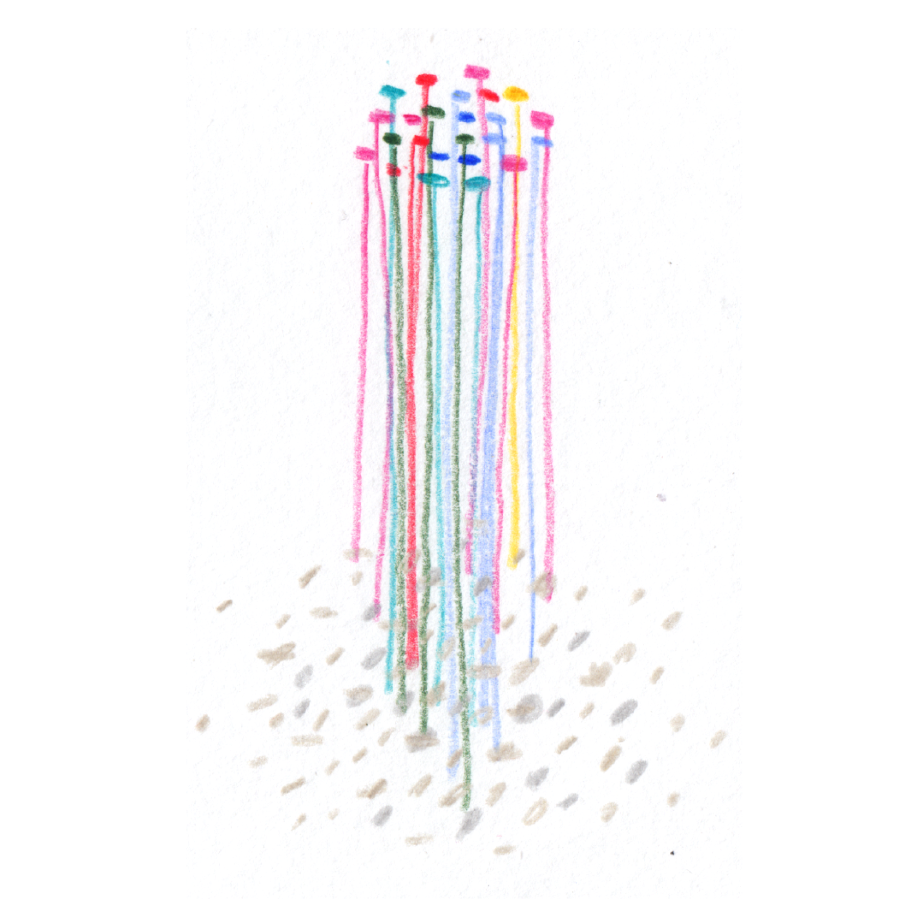
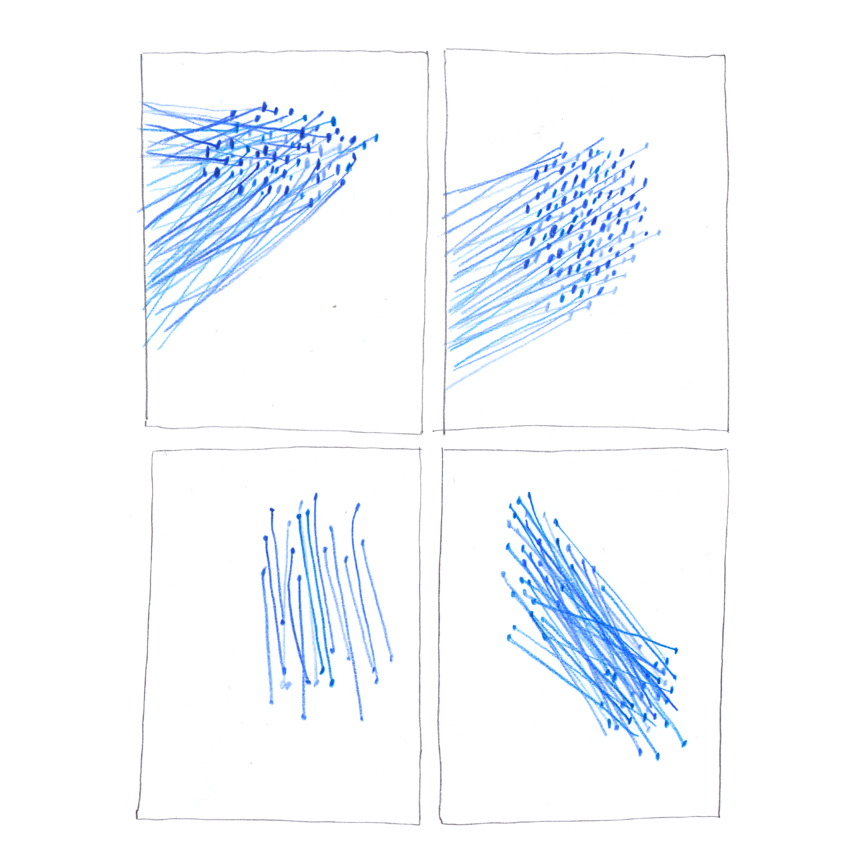
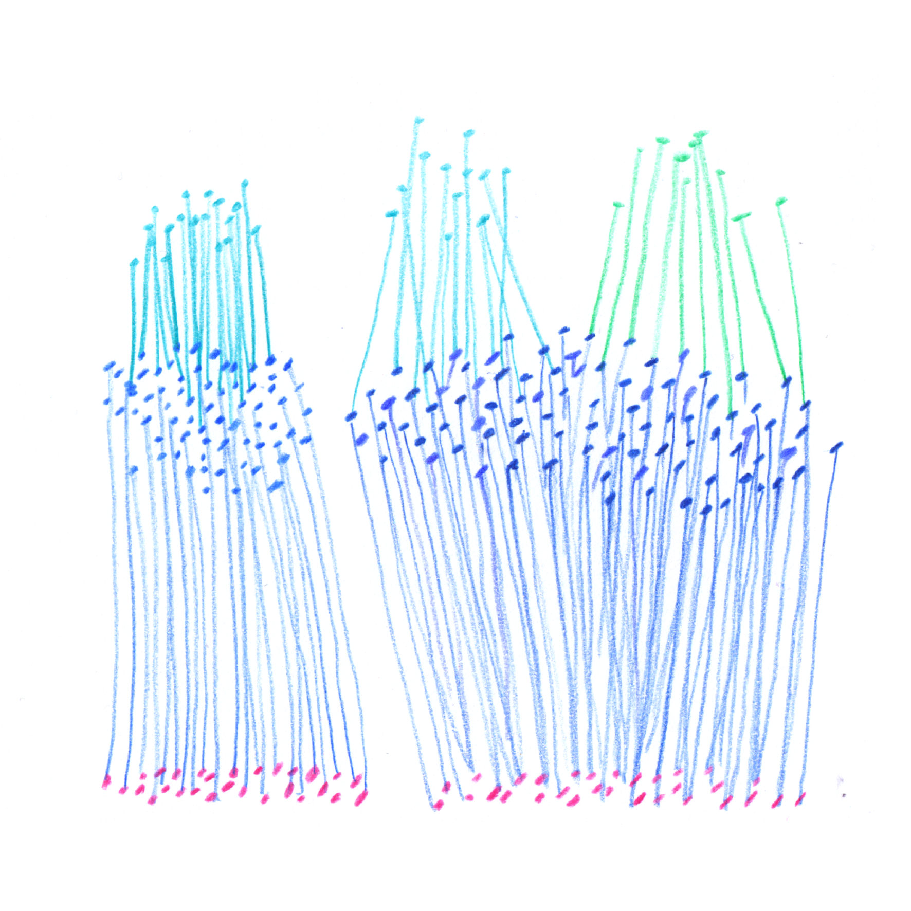
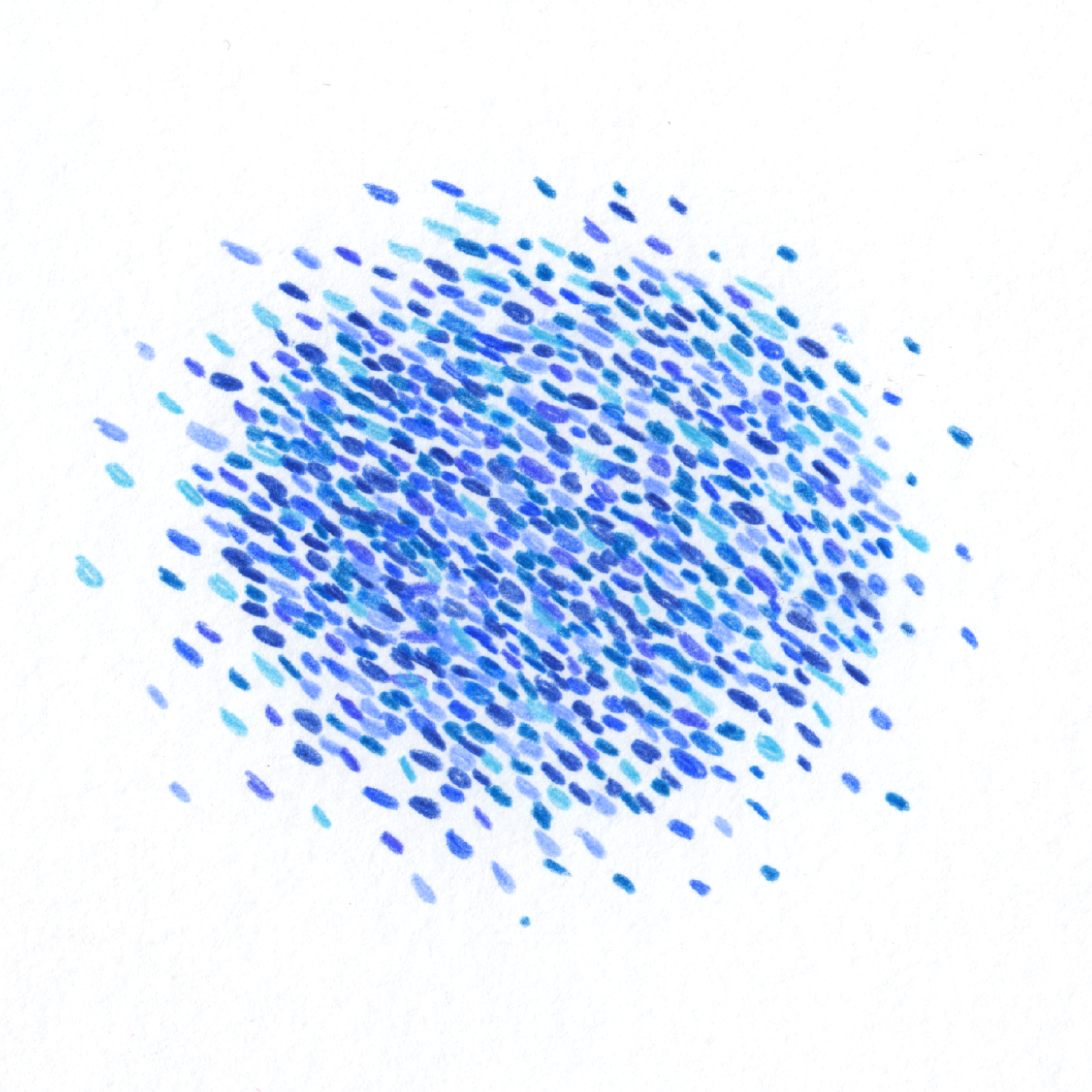
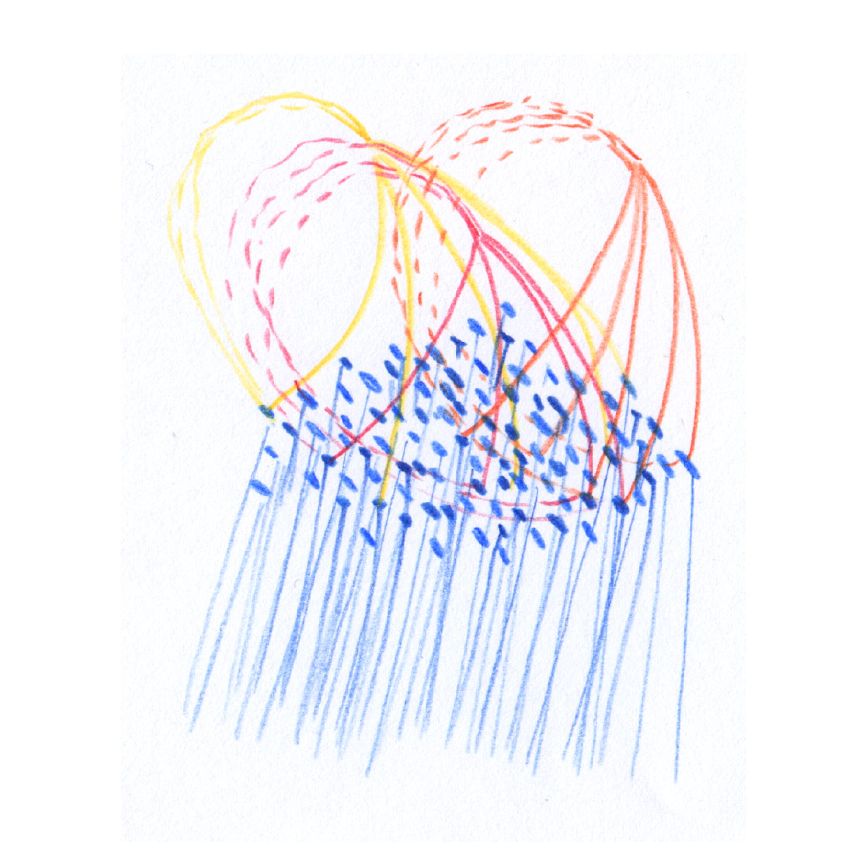
In-progress sketches