Data Murmurations: People Like You
Can drawing help us understand a system better than a spreadsheet can?

Data Murmurations was completed during my art-as-inquiry residency with People Like You, a UK research group studying the impacts of data personalisation on society. Working with Helen Ward at Imperial College, I investigated how data is used to personalise medicine.
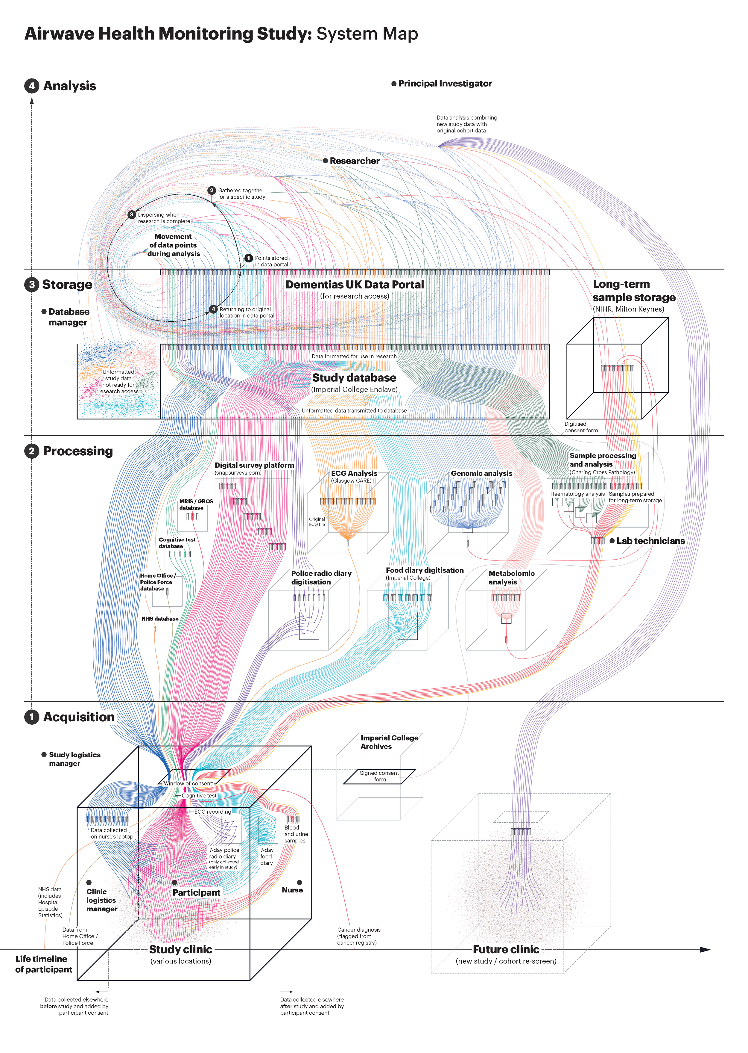
Using my art practice, I explored how biobank stakeholders perceive the ‘people behind the numbers’ – those who consent to storing their samples and data for research. I focused on the Airwave Health Monitoring Study, a cohort study and biobank tracking 53,000 UK police officers since 2003.
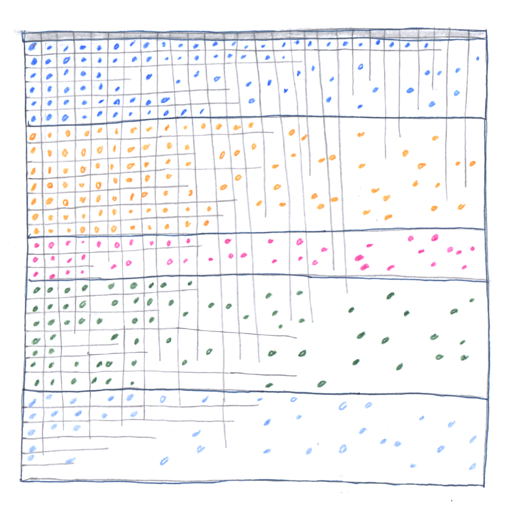
But how do you visualise something that doesn’t have a neat dataset? Some information was inaccessible; the study’s data was messy, fragmented, and inconsistently collected over time.
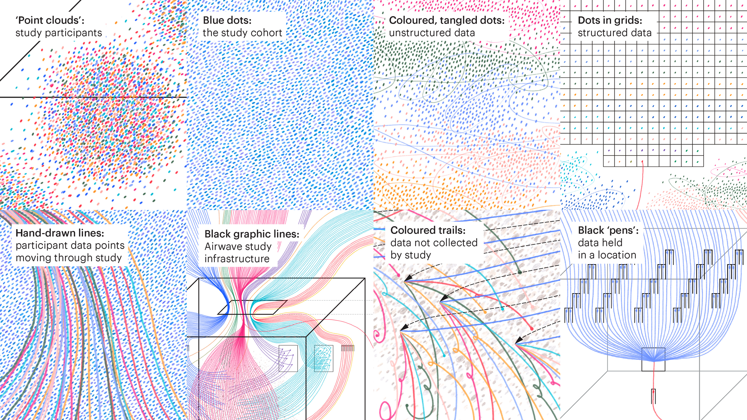
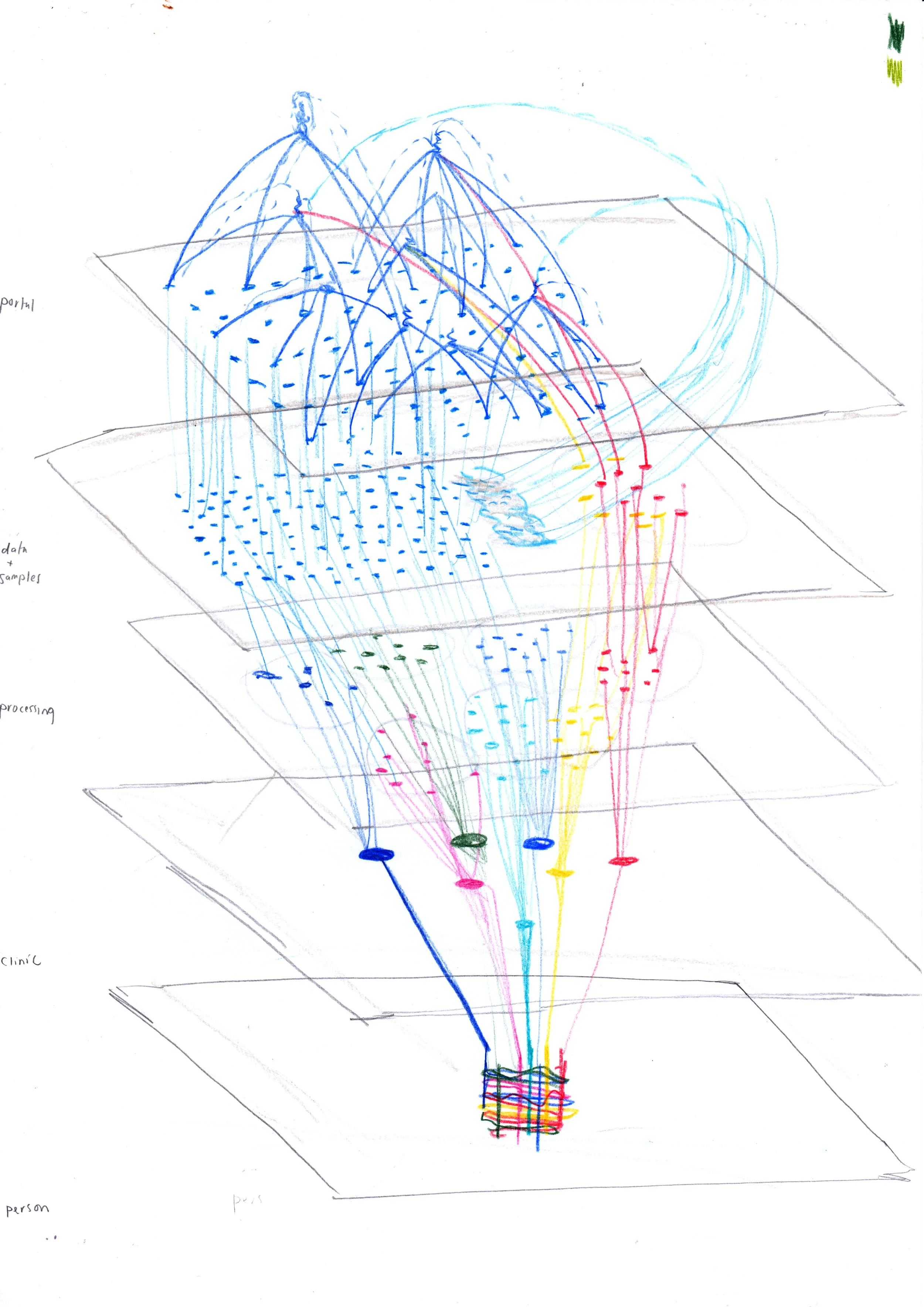
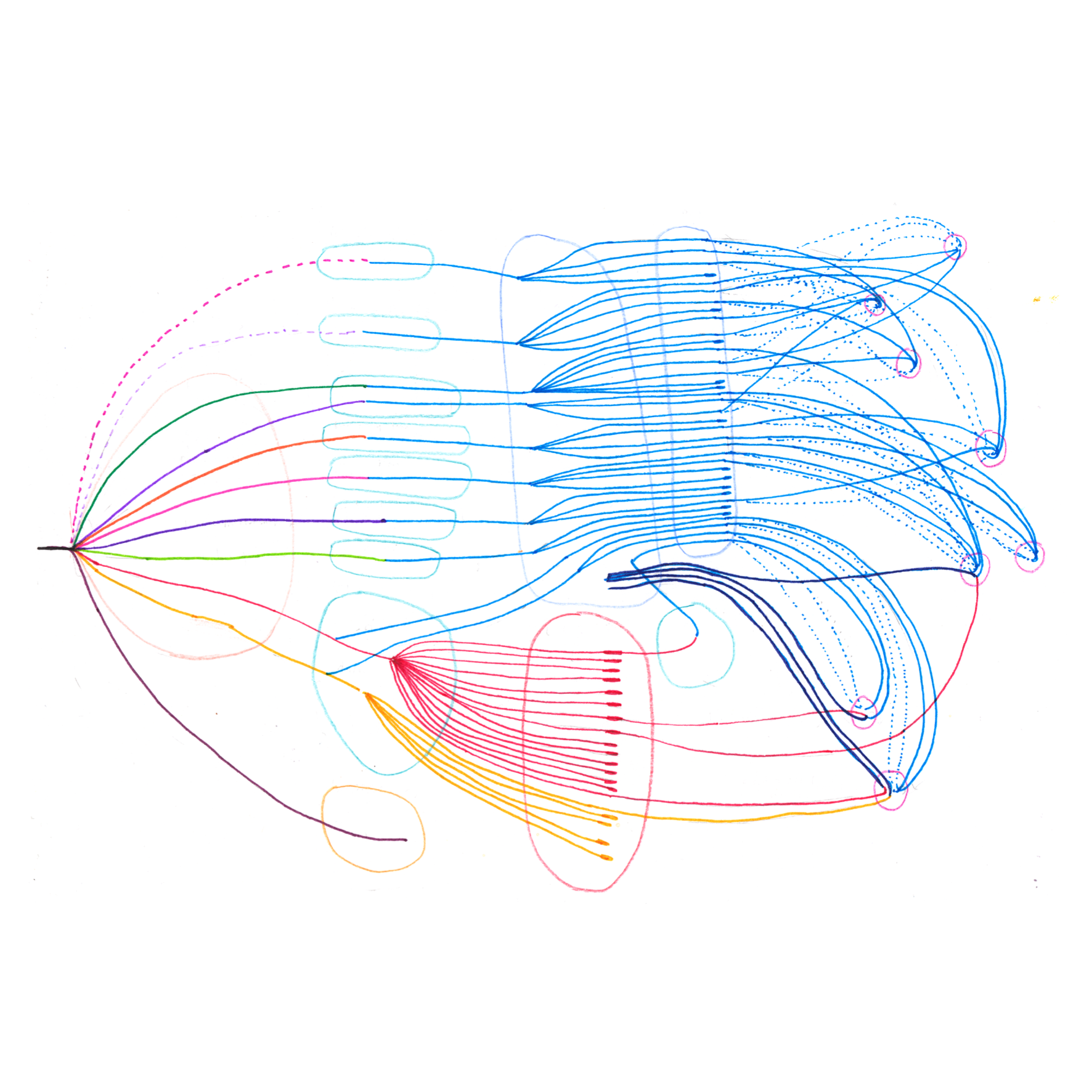
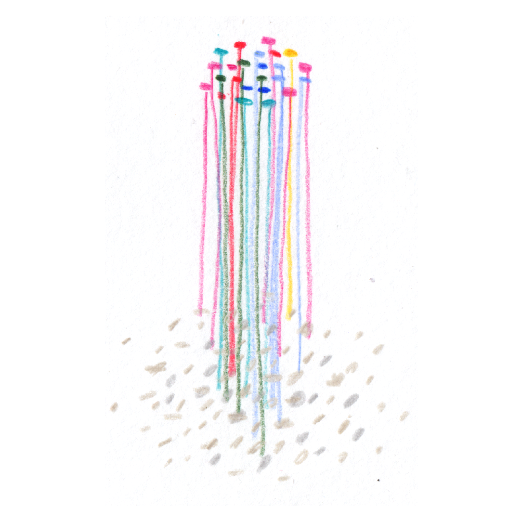
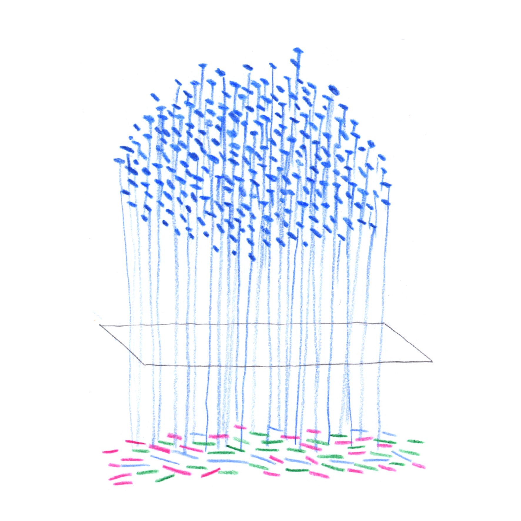
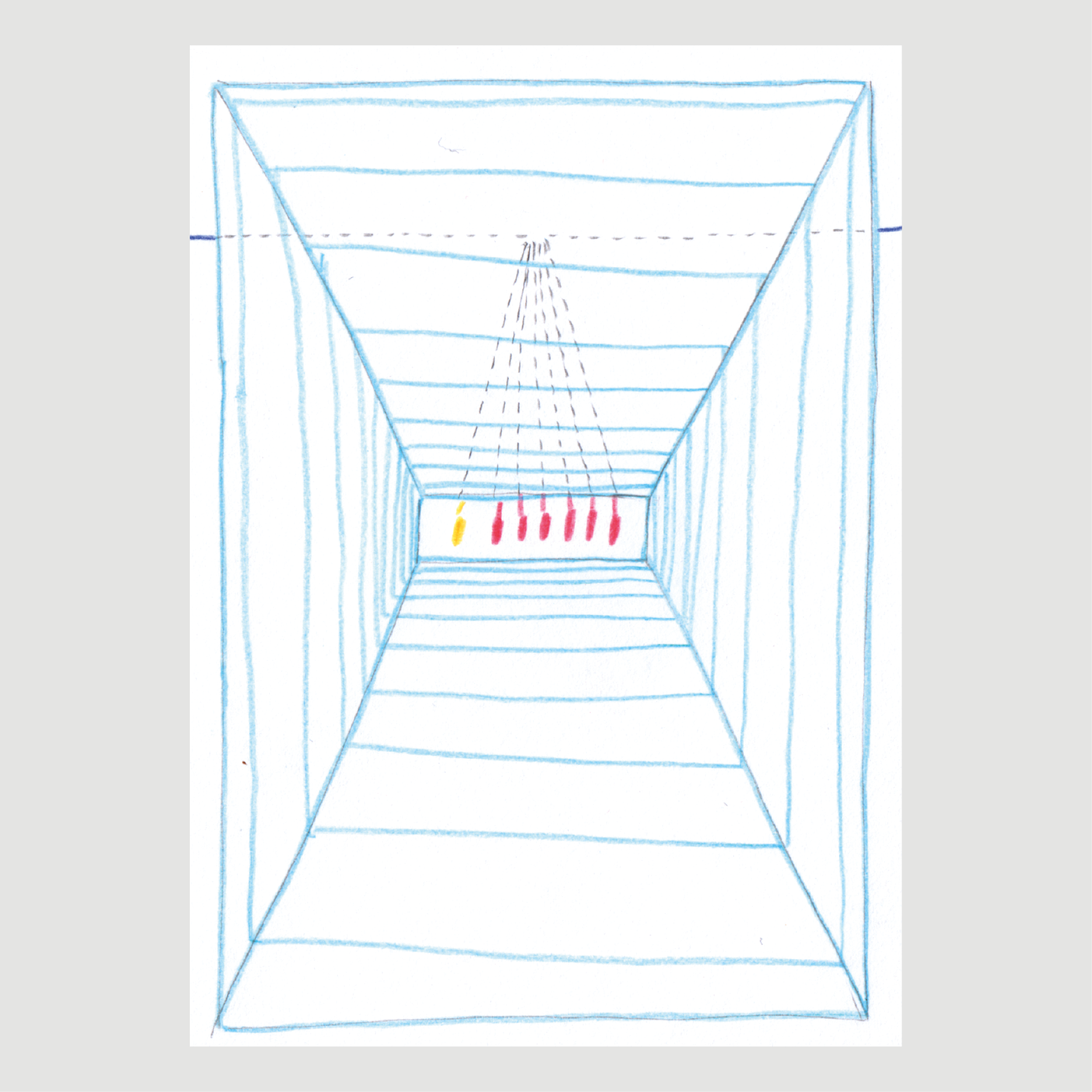
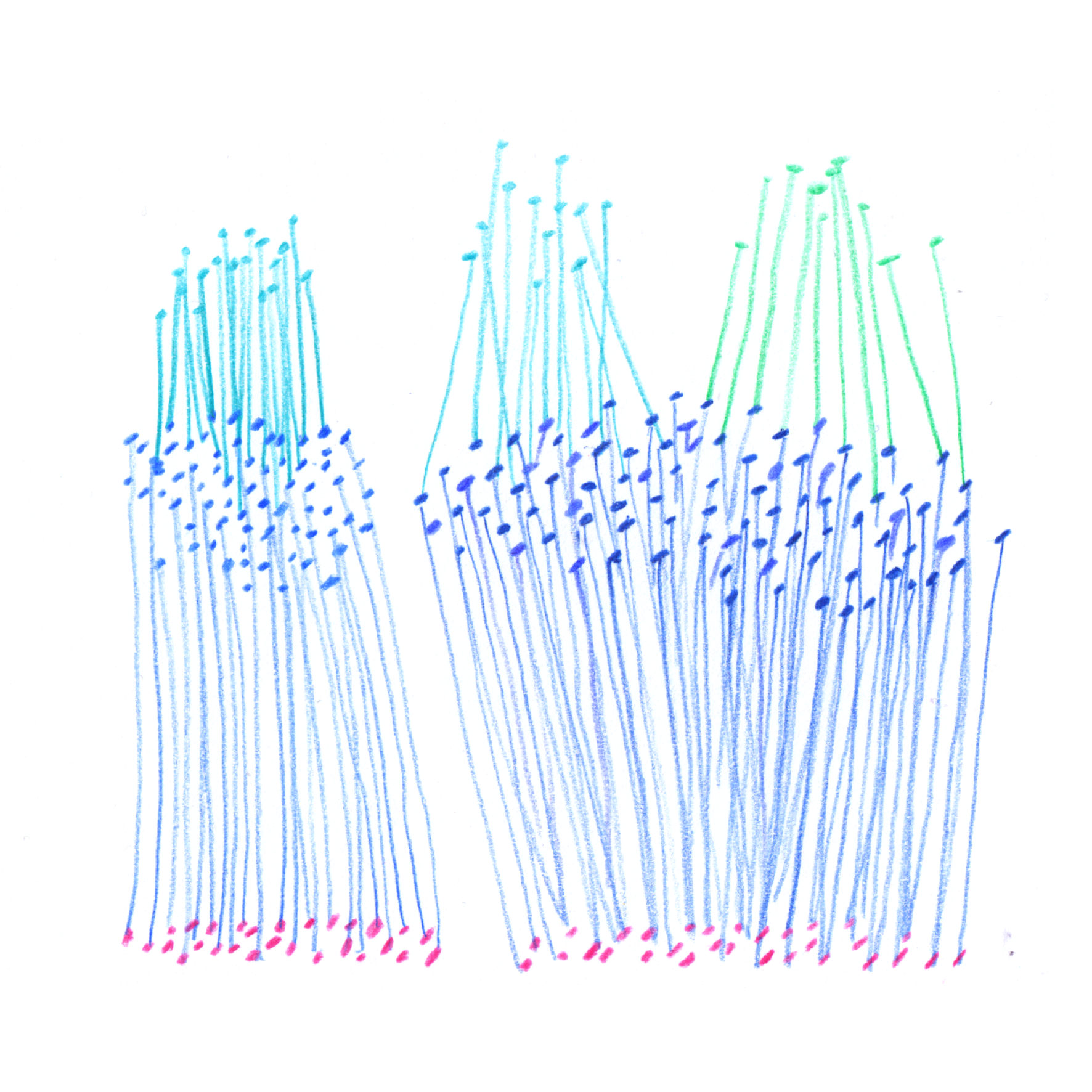
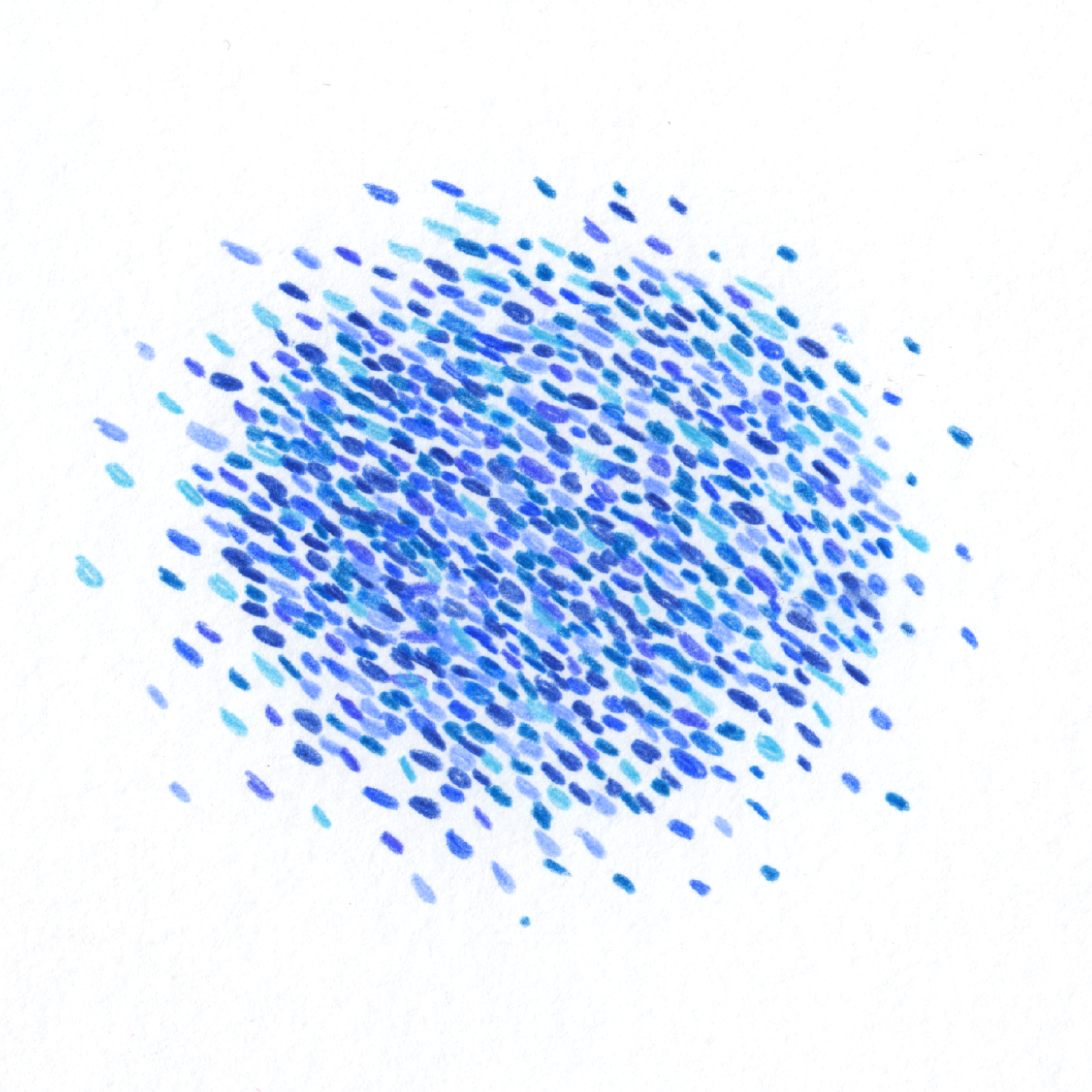
I set aside conventional data visualisation processes and started drawing, which became my way of making sense of the unknown system. I sketched biobank processes to map connections, then built a universal visual language with consistent graphic elements.
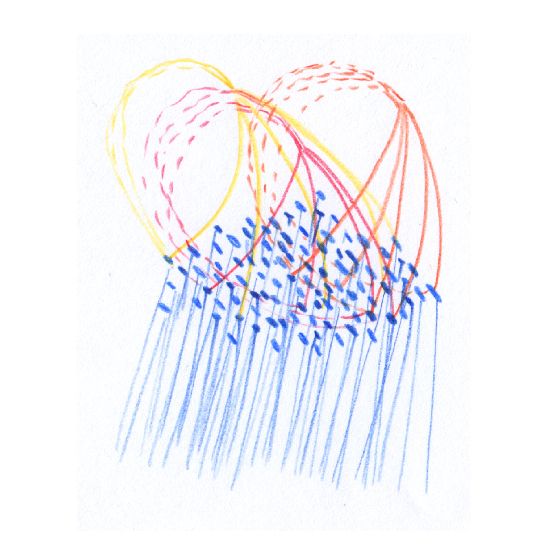
This led me to Marcel Duchamp’s The Large Glass – not just an artwork, it's also an ‘artistic diagram’ of a process he wanted to visualise. Every visual element serves a purpose, and the piece can be fully annotated. Inspired, I created my own ‘artistic diagrams’ to explain the biobank, representing complex research processes while embracing necessary imprecision.
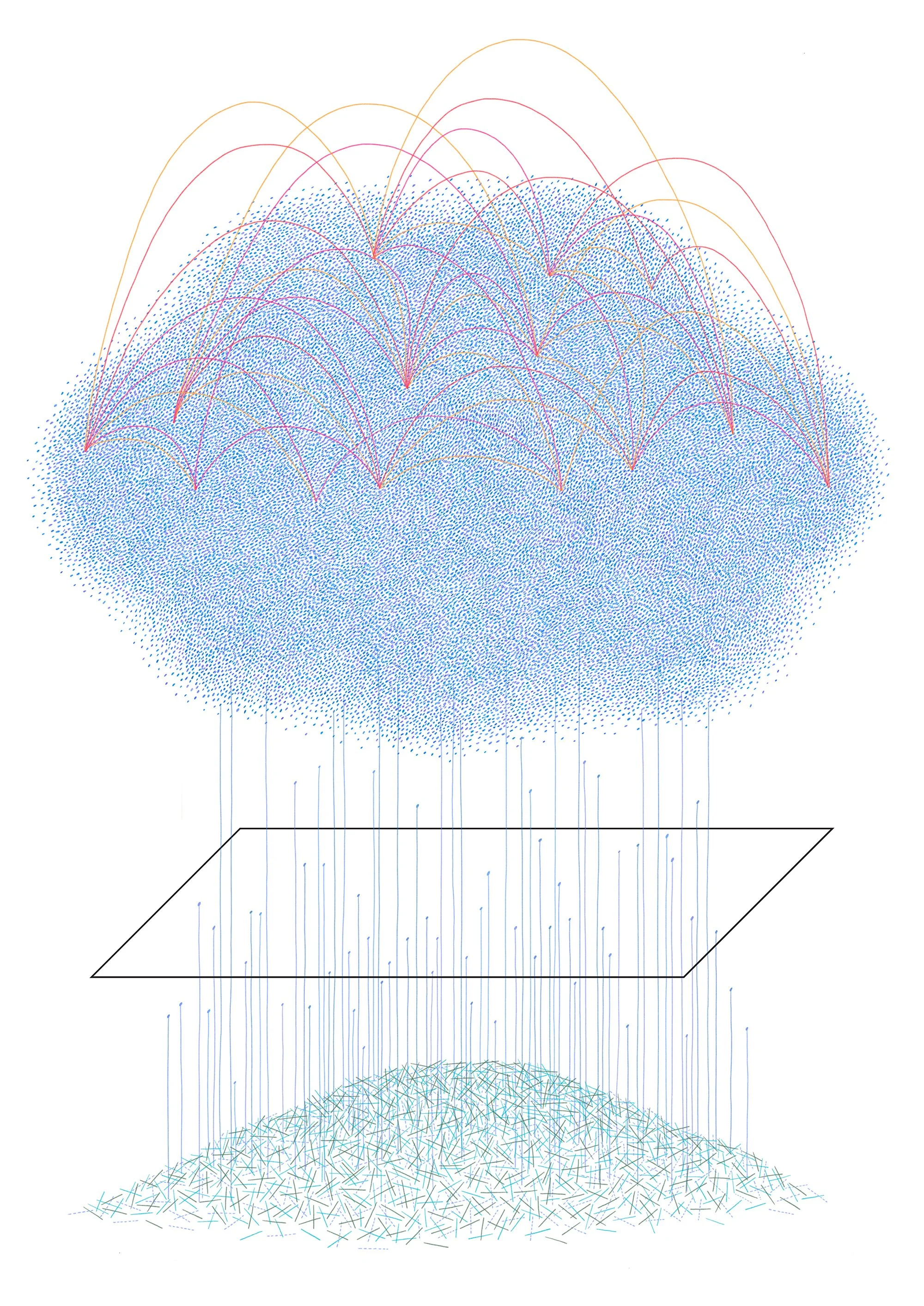
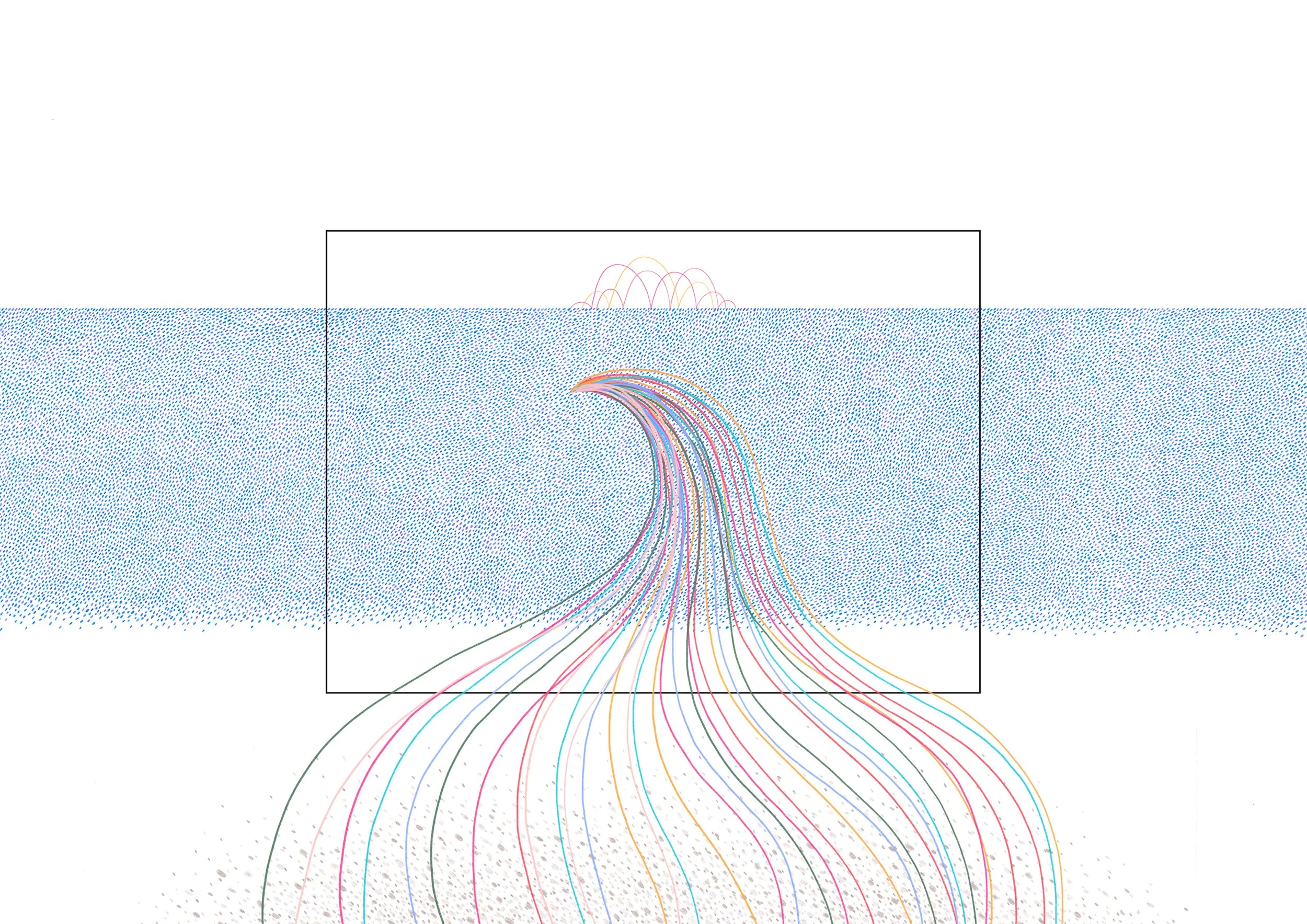
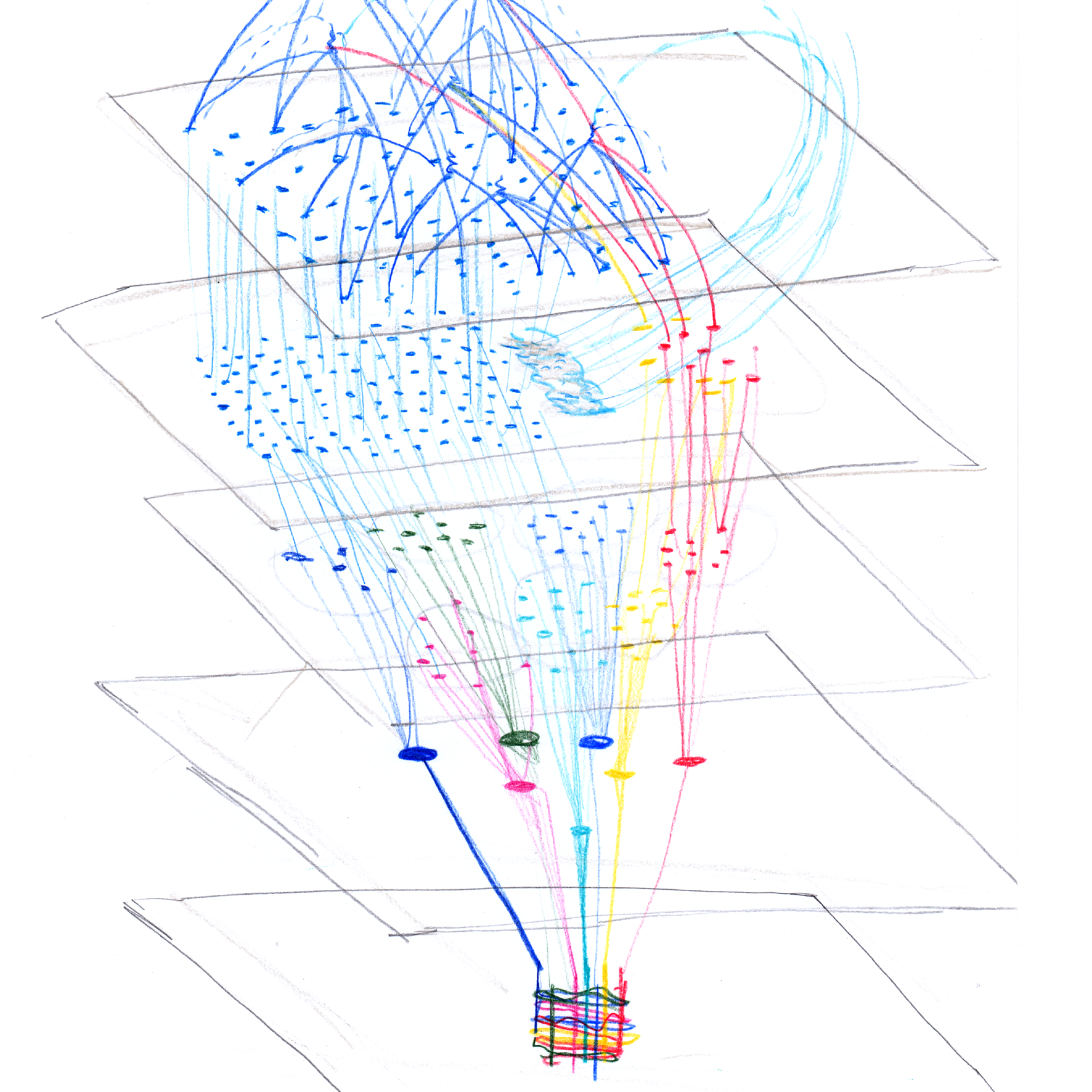
I used my visual language to draw the entire biobank system, where the flow of data and biosamples was accurate but the number of data points were illustrative rather than exact. I drew how different stakeholders (Nurse, Database Manager, etc.) ‘see’ participants differently, depending on their role. These diagrams used the same visual language as the system map, functioning like The Large Glass – fully understandable when annotated, offering an alternative to academic papers.
I’ve loved researchers’ positive response to these qualitative diagrams. While not precise representations of ‘hard’ data, they spark conversations and shape new mental models of how a cohort study works.

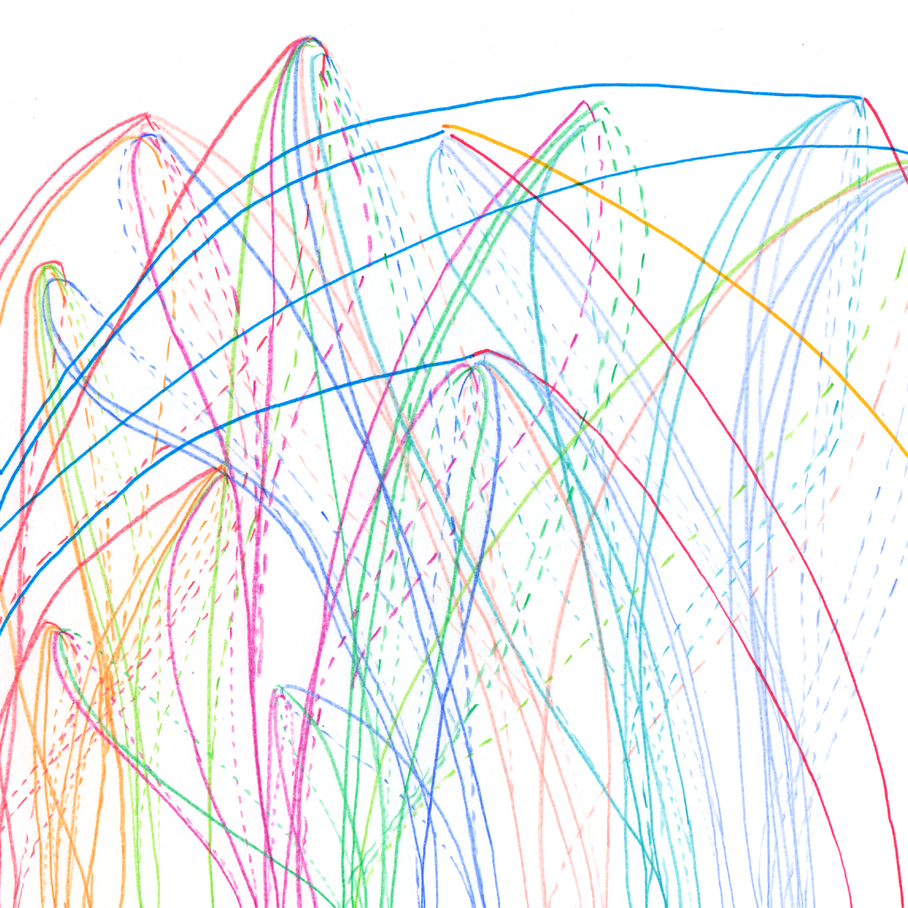
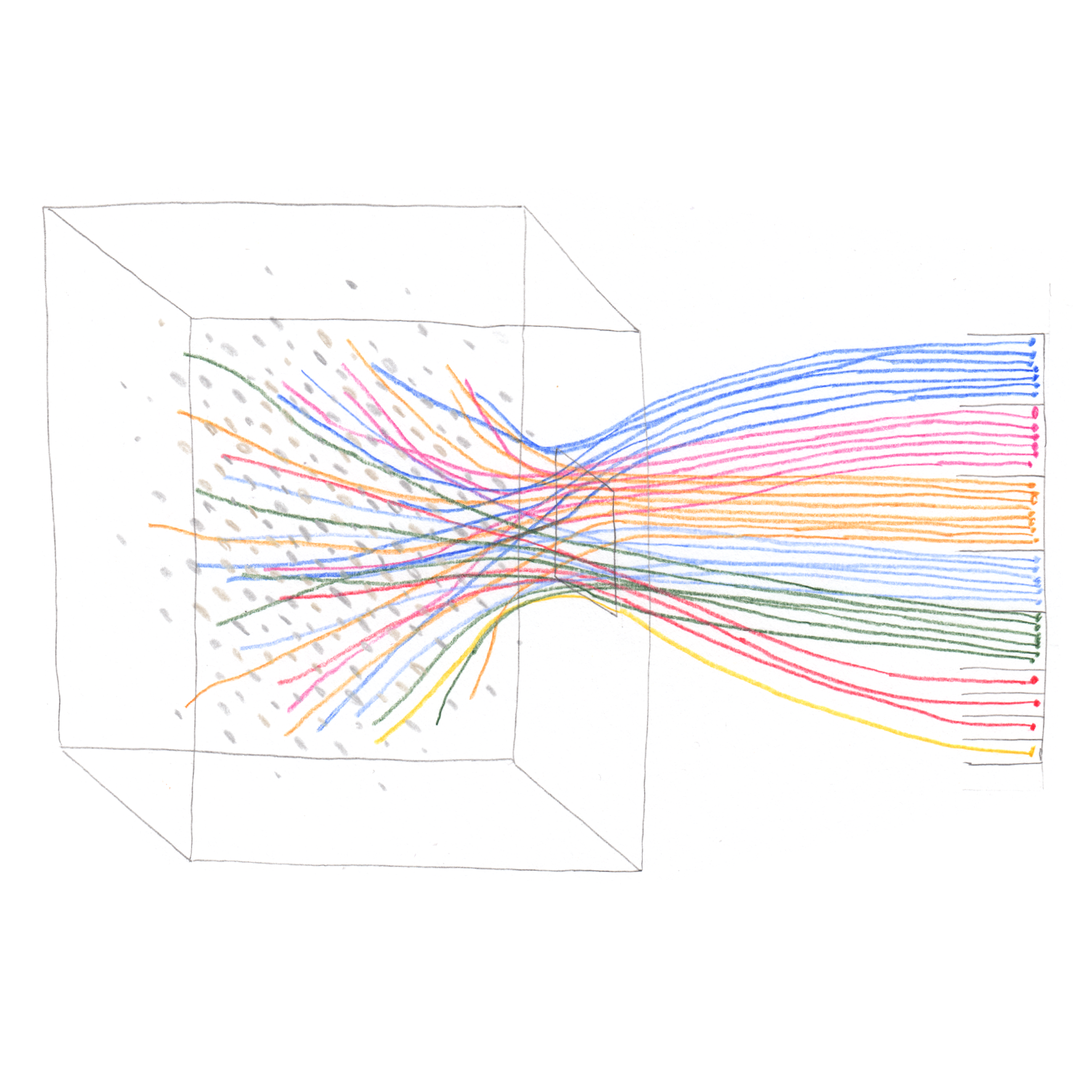
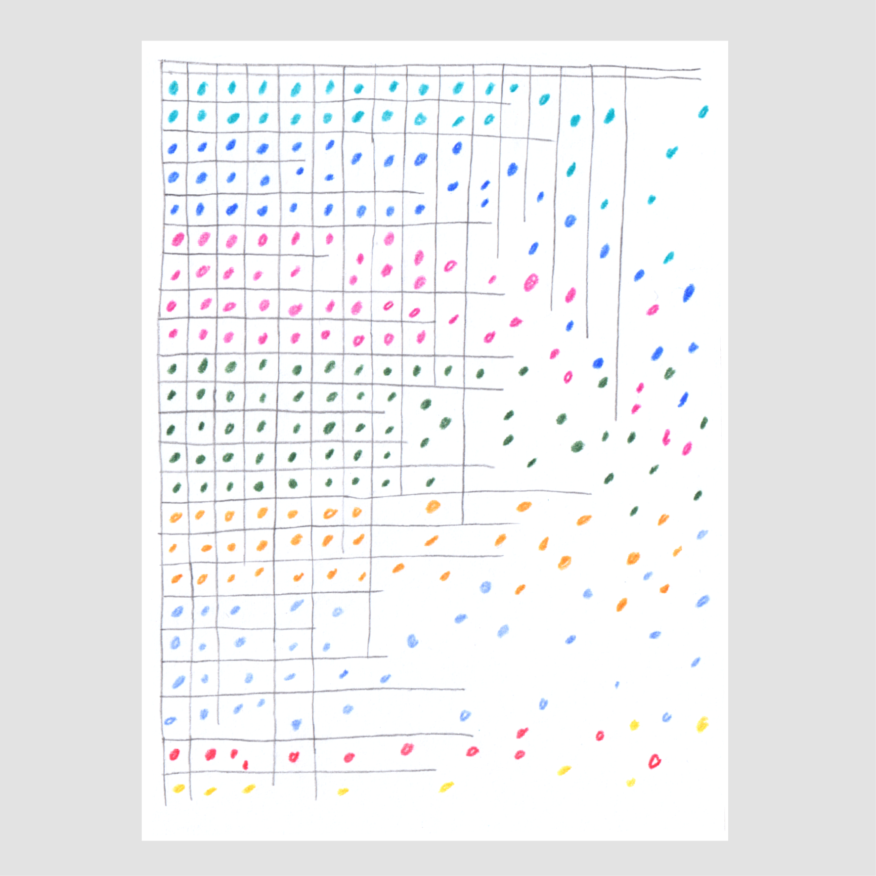
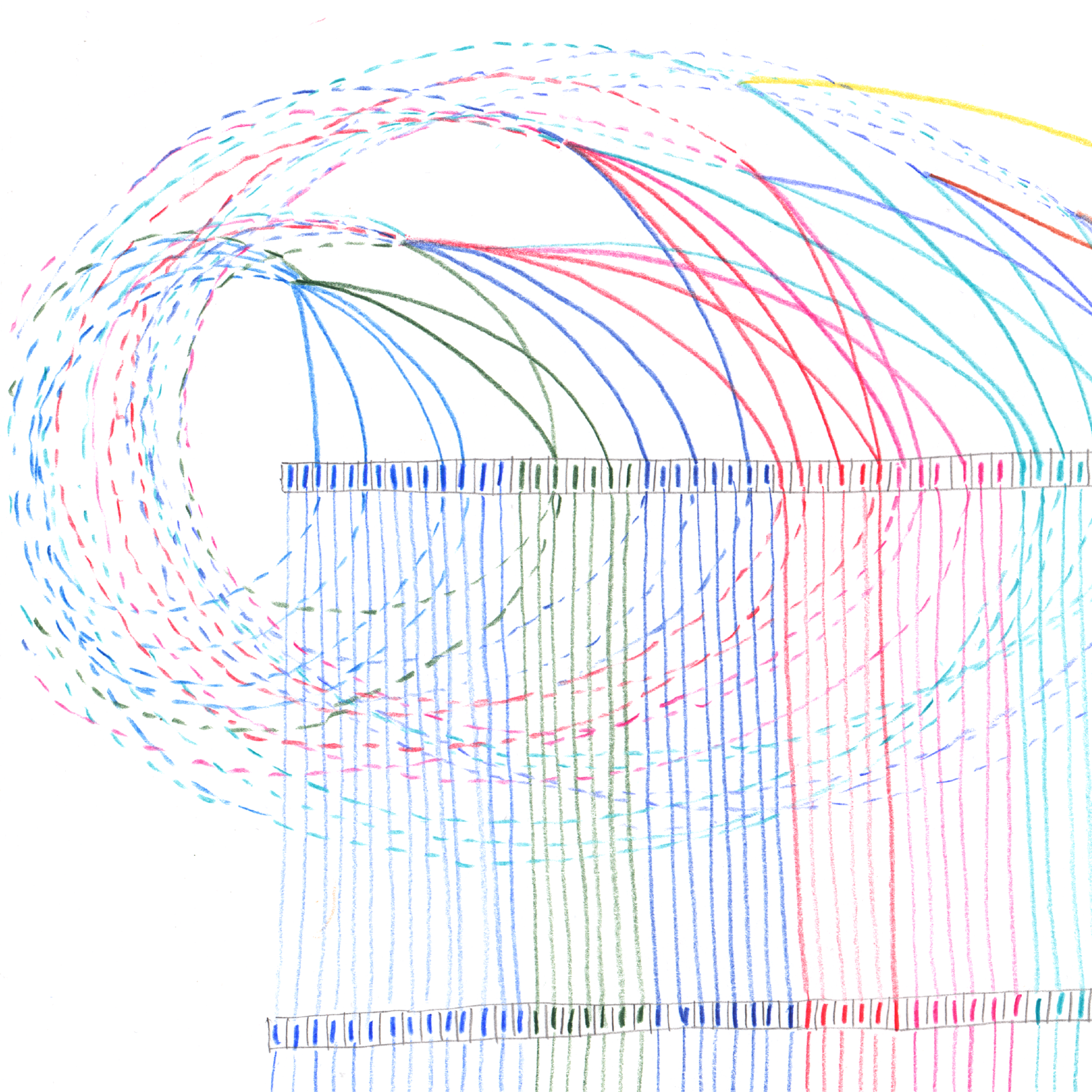
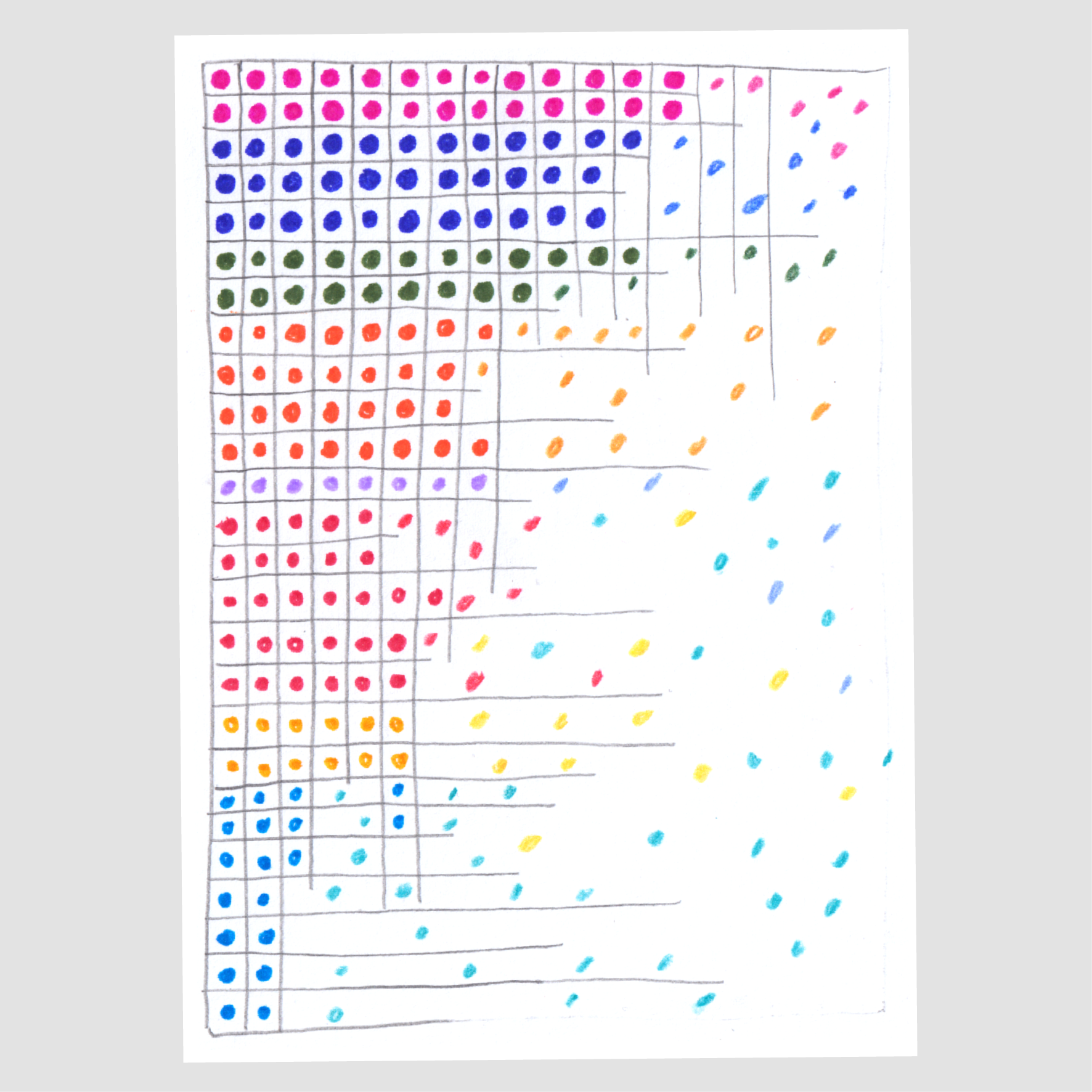
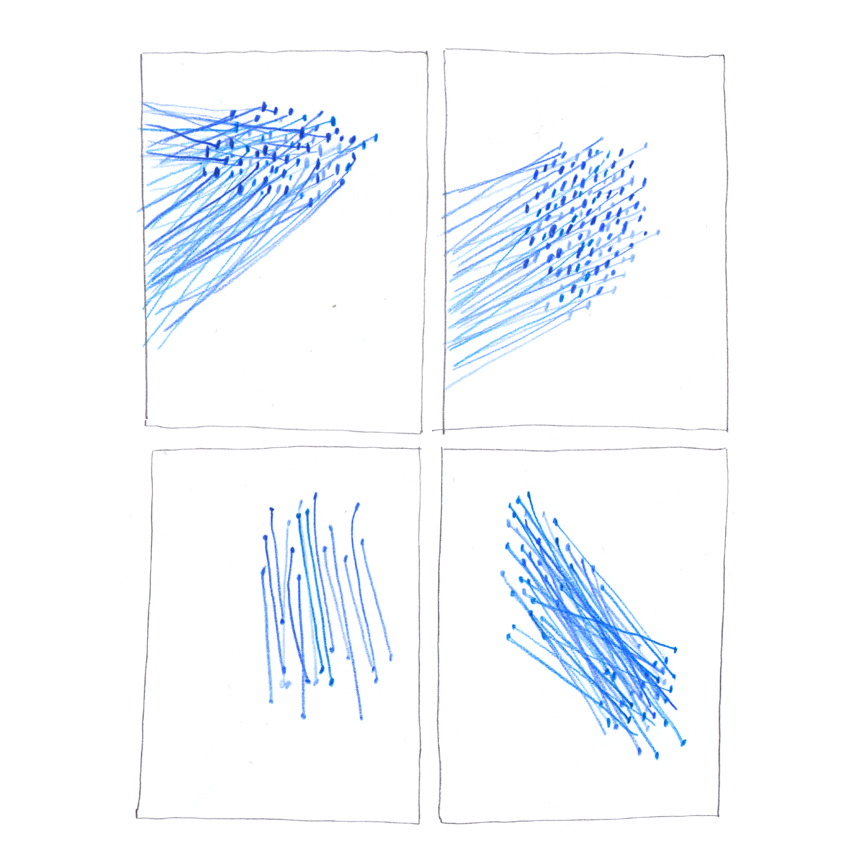
The system’s universal visual language